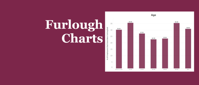
Our chart presents recent statistics on furloughed staff throughout the pandemic. Younger and older people were both more likely to be furloughed compared to those in between. Those with high levels of education have been less likely to be placed on furlough, while the industries that were most an least effected correlate with the extent they have been able to remain open through the pandemic.
Chart of the Week
The majority, if not all students have felt a significant impact on their learning since the start of the pandemic. What has been less clear, however, is the magnitude of this impact. The chart sheds some light on those that have been hit the hardest.
Chart of the Week
The pandemic, as well as the government’s response to it, has accelerated the growth in house prices relative to rental prices, and weakened the London housing market relative to the rest of England.
Chart of the Week
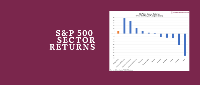
Investors have flocked to those sectors which they believe will benefit from lasting post-pandemic trends, and avoided those that have proven less resilient – with Information Technology up 29% at one extreme, and Energy down 41% at the other.
Chart of the Week
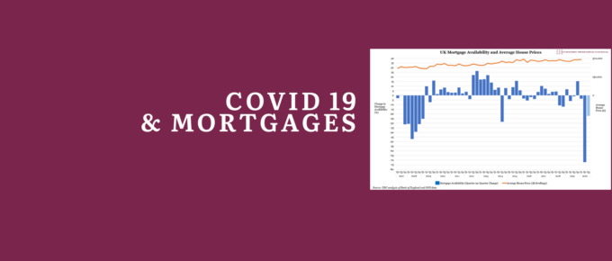
According to the Bank of England, the availability of mortgages declined dramatically in the three months ending May 2020 – implying a bigger credit squeeze than in the worst three-month period of the global financial crisis.
Chart of the Week
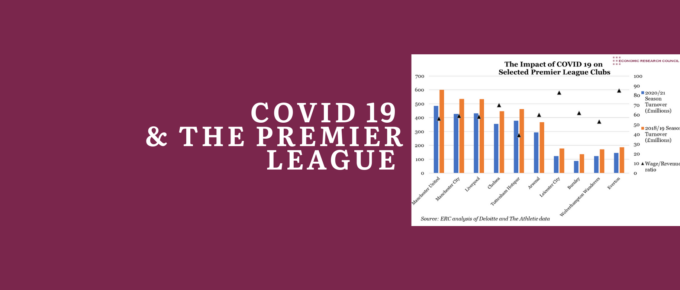
Wayne Rooney decried that ‘[If] Manchester United or Man City need 30 per cent of their players’ wages to survive… then football is in a far worse position than any of us imagined.’.

