Prof. Özlem Onaran
Chart of the Week
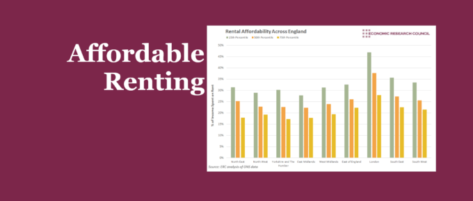
The extent to which can affordably rent varies considerably across the country, with London, naturally, being least affordable. We show that this isn’t just an issue for those on lower incomes.
Chart of the Week
The majority, if not all students have felt a significant impact on their learning since the start of the pandemic. What has been less clear, however, is the magnitude of this impact. The chart sheds some light on those that have been hit the hardest.
Chart of the Week
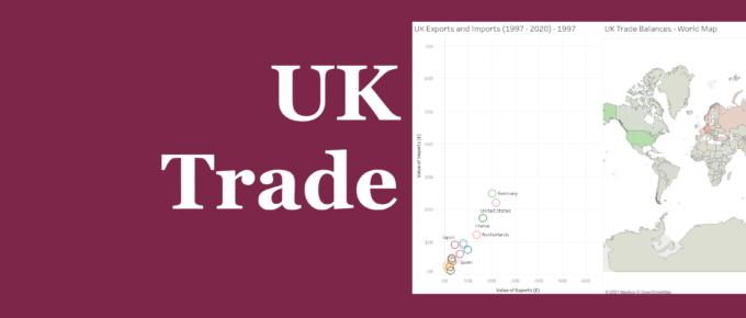
We invite you to explore the data to understand the characteristics of UK trade. Observe how patterns of trade have changed over time between the UK and key trading partners. Hover over each country to view the value of exports and imports, as well as the balance of trade.
Chart of the Week
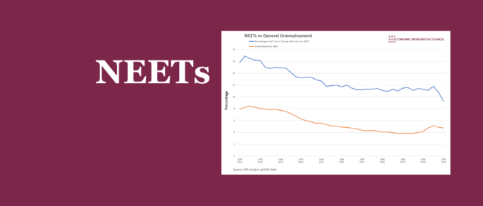
The turn of the year brought a rapid reduction in NEETs relative to general unemployment. Higher education has had a significant impact on this figure. Whilst employment in 16-24 year olds seems to play a part, a broader assessment presents concerning conclusions.
Chart of the Week
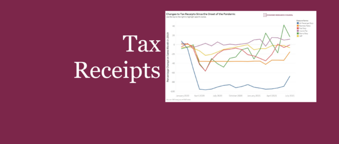
Tax receipts were pummelled due to lower economic activity associated with the COVID pandemic. This chart highlights the development of notable duties that together help to highlight the effect of the pandemic on government income. Use the interactive chart to focus on specific duties.


