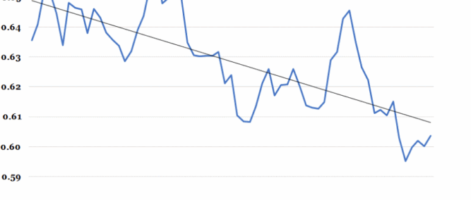
The world economy cannot sustain itself if the majority of its participants are experiencing a decline in real income. Since inequality is not a self-evident vice, this raises the stakes…
Chart of the Week: Gender, Disability, Wages and Employment
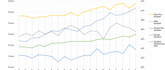
While non-disabled men’s and women’s wages have been incrementally rising since 2013, those of their disabled counterparts…
Chart of the Week: Week 22, 2017: Household Income Distribution
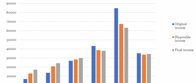
The chart shows that average disposable household income for the top quintile of UK households stands at over £67,000 and that of the poorest quintile is just over £13,000, more than 5 times lower.
Chart of the Week: Week 14, 2017: Trends in Take-Home Pay
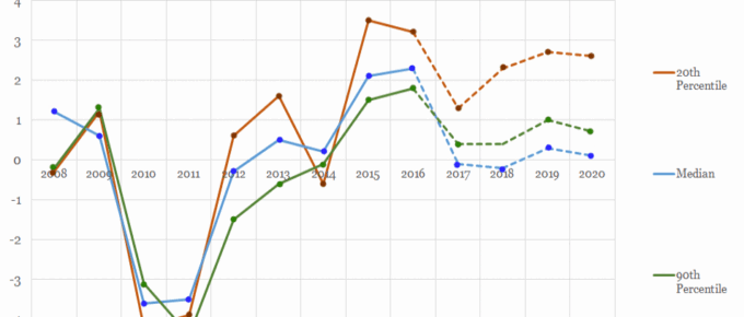
The chart shows that take home wages for the 2nd and 9th decile of earners have been strongly correlated in the years since the financial crisis.
Chart of the Week: Week 13, 2017: Gender Pay Gap by Country
This Tuesday 4th April was ‘Equal Pay Day’, a date symbolically chosen in the USA for two reasons: it roughly represents the date when the average woman would need to work to, from 1st of January 2016, to match the average man’s 2016 earnings.
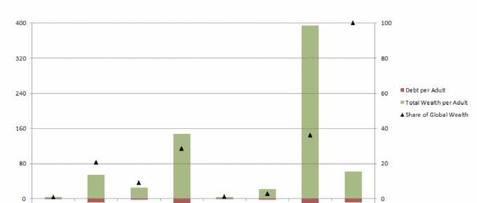
Chart of the Week: Week 52, 2016: Wealth and Debt per Adult by Continent
The chart demonstrates the vast disparities in wealth per adult across the world. North America and Europe hold 65% of the world’s wealth, whilst only accounting for 18% of the world’s adult population.

