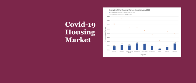
The pandemic, as well as the government’s response to it, has accelerated the growth in house prices relative to rental prices, and weakened the London housing market relative to the rest of England.
Chart of the Week
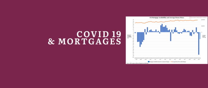
According to the Bank of England, the availability of mortgages declined dramatically in the three months ending May 2020 – implying a bigger credit squeeze than in the worst three-month period of the global financial crisis.
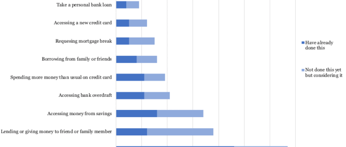
Covid 19: How are people are making ends meet?
There is a risk that following the shock of the pandemic and poor economic recovery, deep seated pessimism may set in for the young, who already feel that their lives will be less prosperous than their parents’.
Chart of the Week: Historical Chinese Residential Property Market Trends
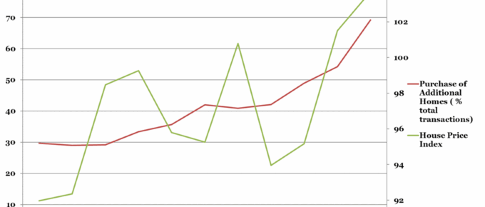
It would be unremarkable were house prices increasing as a function of total home purchases,
however, this graph shows that the key driver of HPI rises is not the fundamental demand for
housing. Rather it is in response to…
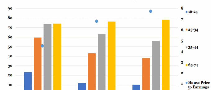
Chart of the Week: 20th June 2018: Home Ownership vs House Price to Earnings Ratio
Last year saw the emergence of five London boroughs where houses ‘earned’ more in a year than their owners; most starkly in Barnet, where on average home-owners earned £54.6k net whereas their homes grew in value by nearly £107k.
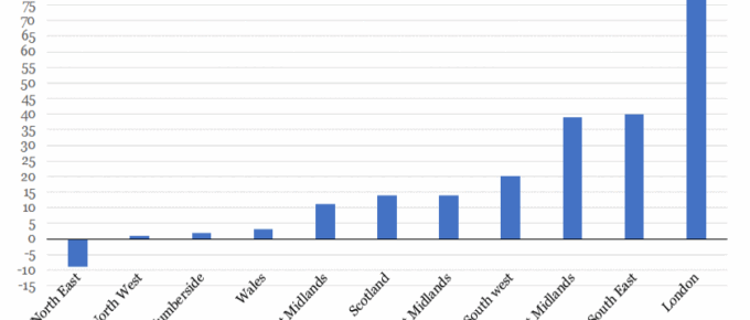
Chart of the Week: Week 33, 2017: UK Houseprice Growth since the Financial Crash
This chart shows that London house price growth over the last decade has far outstripped all other regions in the UK, with areas of staggering growth such as Hackney, which rose 120%.

