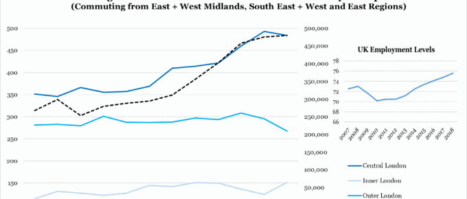
London had the least affordable housing, with a ratio of 11.98, meaning workers required nearly 12 times their annual salary to purchase a home. Although some of the highest wages are concentrated in London…
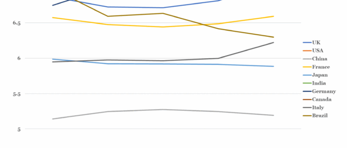
Ten Largest Global Economies: Happiness Index since 2015
Out of the countries shown, the UK is perhaps the most confounding. Over the data period it has experienced significant political upheaval and societal division, centered around the Brexit vote. In 2016, the statistics suggest that Britain actually became happier and has remained on this trend until the end of the data period…
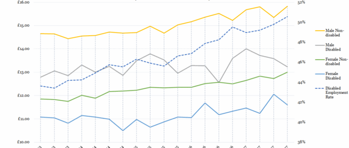
Chart of the Week: Gender, Disability, Wages and Employment
While non-disabled men’s and women’s wages have been incrementally rising since 2013, those of their disabled counterparts…
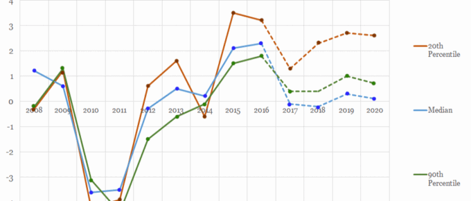
Chart of the Week: Week 14, 2017: Trends in Take-Home Pay
The chart shows that take home wages for the 2nd and 9th decile of earners have been strongly correlated in the years since the financial crisis.
Chart of the Week: Week 42, 2016: Inflation vs. Earnings
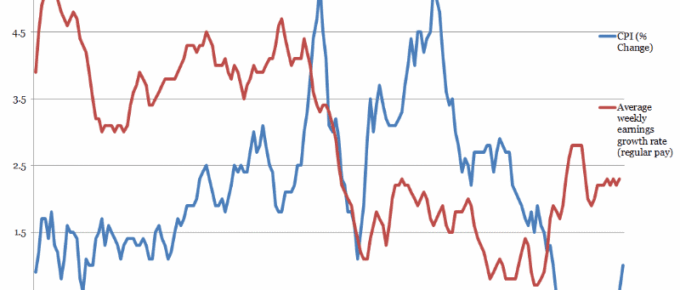
The latest ONS figures, released yesterday show that inflation seems to be in the initial phase of converging with wage growth, currently at a tolerable level.
Chart of the Week: Week 3, 2016: Employment and Earnings
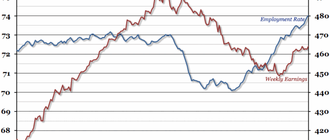
Labour market statistics were released today, and they showed another record high employment rate (74%).

