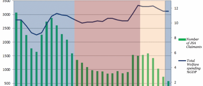
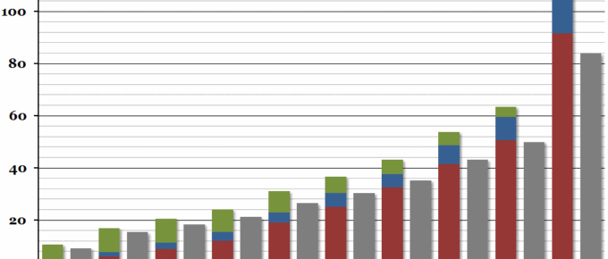
The chart demonstrates the variation in welfare spending under each successive UK government.
Chart of the Week: Week 45, 2016: US GDP and Unemployment
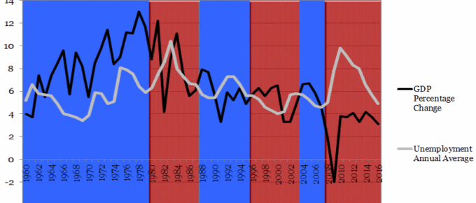
The chart shows that with the exception of 2 occasions, each time the incumbent was ousted at general election, GDP had fallen in the year prior.
Chart of the Week: Week 35, 2016: Crime and the Economy
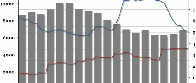
Despite the experience of the 1980s when crime rose sharply with unemployment, crime rates in the UK have remained static post the financial crisis despite large fluctuations in unemployment.
Chart of the Week: Week 32, 2016: UK Private Rent inflation
Over the past 5 years, rental prices in the UK on average have remained broadly stable.
Chart of the Week: Week 21, 2016: Regional Disposable Income
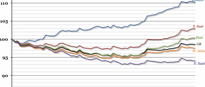
Data released by the ONS this morning showed that the gap in gross disposable income between the richest region of the UK (London) and the poorest (Northern Ireland) opened up to the largest it has been since records began in 1997.
Chart of the Week: Week 8, 2016: UK Income Distribution
The Office for National Statistics released a report yesterday on household income for the financial year 2014/15.

