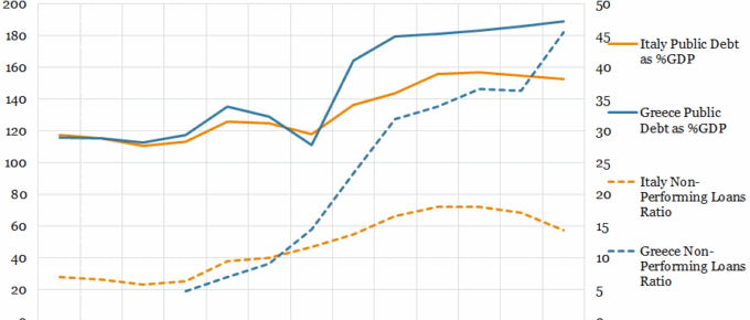
The chart demonstrates that, although Italy and Greece share a similar narrative in terms of poor loan performance across business, personal and residential loans; they have experienced widely differing outcomes. This reflects….
September 2018
Looking across the Atlantic, one has to start thinking that Europe is becoming a sideshow to the Pacific Rim countries. Relations between the US, China and Russia are of greater importance to the global economy…
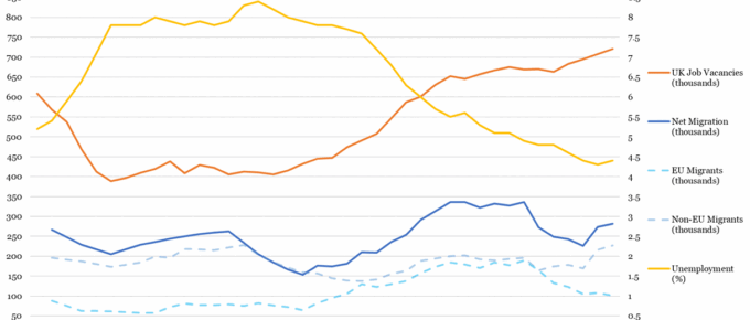
Chart of the Week: Week 29, 2018: Historical UK Unemployment & Vacancies vs Migration
Following the recession, unemployment increased to its highest level since 1995 at 8.4% of the workforce in 2011 Q4. It has since recovered, halving to its current rate of 4.2%, (898,700 persons) , its lowest since 1975. Recent trends in job vacancies and unemployment are…
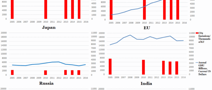
Chart of the Week: Week 29, 2017: Top 6 Polluters’ Emissions v.s. GDP
The set of graphs generally indicates that developed countries are beginning to reduce their emissions, whereas India and China are seeing their emissions rise, as they undertake vast infrastructure projects and continue to lift sizeable populations out of poverty.
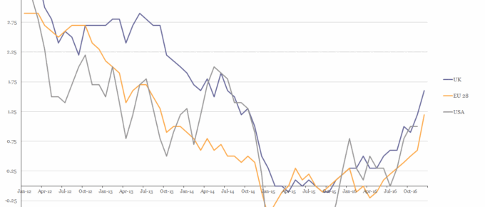
Chart of the Week: Week 6, 2017: USA, EU28 and UK Inflation
The chart shows that in 2016 the HICP rate of inflation for all three parties rose above 1% for the first time in over 2 years.
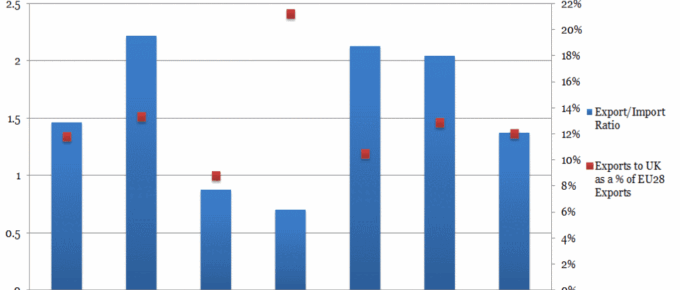
Chart of the Week; Week 41, 2016: EU Nations’ Reliance on Trade with the UK
The chart shows some aspect of each nation’s position on trade with the UK in the run up to Article 50 negotiations with access to the single market being the key issue.

