Wednesday 13th April 2022, Geological Society, 6.30pm.
Chart of the Week
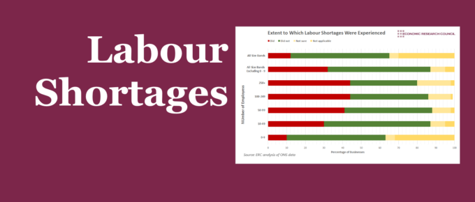
Businesses in recent months had to deal with the major difficulty of hiring and retaining workers, in the current post-pandemic economy, but the latest data suggests that the job market still exhibits strength.
Chart of the Week
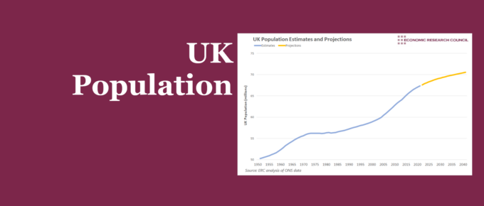
The UK experienced population growth in a somewhat cyclical manner during the 20th century. The determinants of this growth have changed over time, indicating slightly different patterns of growth in the future.
Chart of the Week
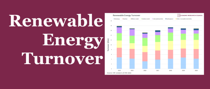
Falling turnover in industries generating renewable energy presents challenges for the government’s net-zero targets. Can greater reliance on offshore wind be a solution?
Chart of the Week
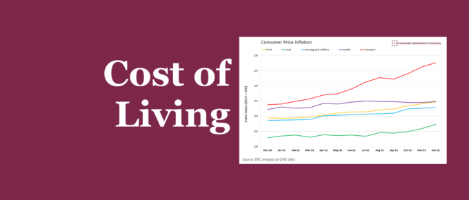
Summary In the past year, people in the UK have experienced larger than normal increases in the cost of living, with some categories of goods having as high as a 14% increase. Skyrocketing gas prices are making logistics, transportation, and energy extremely more expensive. The lorry driver shortage has played a part in this and […]
St Paul’s School League Table
St Paul’s School League Table: Final Results NB: The scores are calculated by giving 1 point for each 0.1 of difference between the prediction and the confirmed figure. The number in brackets denotes the number of pennies away from the current Sterling Euro low. Scores are only given where complete figures for the quarter have […]


