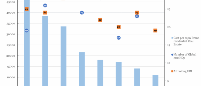
The chart shows that there is little to no correlation between the number of Global 500 companies headquartered in a city and the cost of prime real estate.
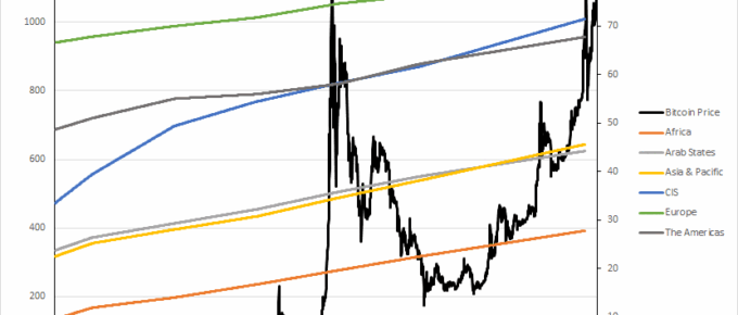
Chart of the Week: Week 7, 2016: Bitcoin Price v.s. Internet Users by Region
The chart shows that Bitcoin is a niche market which bears no correlation to the number or distribution of individuals across the globe who have internet access.
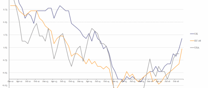
Chart of the Week: Week 6, 2017: USA, EU28 and UK Inflation
The chart shows that in 2016 the HICP rate of inflation for all three parties rose above 1% for the first time in over 2 years.
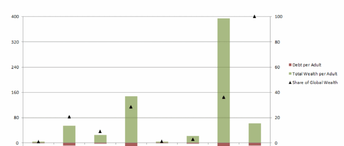
Chart of the Week: Week 52, 2016: Wealth and Debt per Adult by Continent
The chart demonstrates the vast disparities in wealth per adult across the world. North America and Europe hold 65% of the world’s wealth, whilst only accounting for 18% of the world’s adult population.
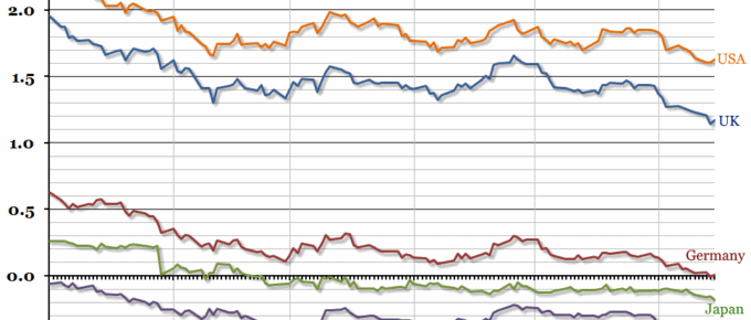
Chart of the Week: Week 24, 2016: Global Government Bonds
Government bond yields in most advanced economies reached record lows this week, with ten year German bond yields entering negative territory for the first time ever.
Chart of the Week: Week 4, 2016: Projected GDP Growth
Tomorrow morning, the preliminary estimate for UK fourth quarter GDP growth will be announced, and we’ll get a first impression of annual growth for 2015.