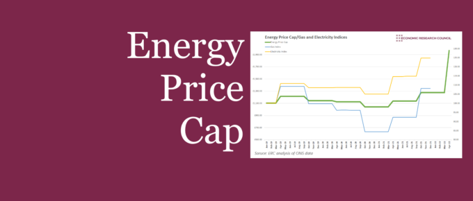
This week, we present a series of charts to examine the price cap, the measures put in place, and what they mean for households.
Chart of the Week
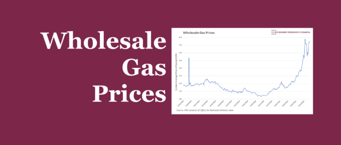
The raising of the energy price cap has attracted a lot of attention and may have assisted in keeping some smaller providers in the market. This week’s chart analyses wholesale gas prices, and what the future may hold if prices continue to rise.
Chart of the Week
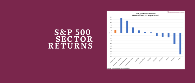
Investors have flocked to those sectors which they believe will benefit from lasting post-pandemic trends, and avoided those that have proven less resilient – with Information Technology up 29% at one extreme, and Energy down 41% at the other.
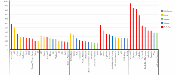
Top Ten Companies by Market Cap over 20 Years
There have been tech booms and oil crashes, bull and bear markets, and periods of retail dominance. However, two companies which have been models of consistency (at least in regard to market cap) are Microsoft and…
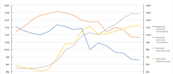
Chart of the Week: Week 4, 2017: Historical Electricity Prices vs Consumption
In this chart we can see that from 2000, consumption by both industry and the public has declined. The price of electricity supplied to both domestic and industrial sectors has risen significantly.
November 2015
We are in the last quarter, the future for North America looks good, Europe confused, China difficult and countries reliant on the production of commodities gloomy. The West and Russia, however….

