
In this inauguration week, the ERC is looking back at the last six US presidents and the state of US economics during their terms.
Latest Blogposts
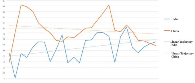
Chart of the Week: Week 2, 2017: China and India Historical GDP Growth
The chart shows that China and India, the world’s two most populous nations, have enjoyed dramatic positive growth over the past 25 years.
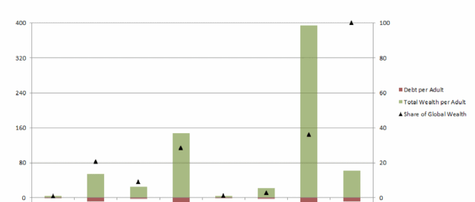
Chart of the Week: Week 52, 2016: Wealth and Debt per Adult by Continent
The chart demonstrates the vast disparities in wealth per adult across the world. North America and Europe hold 65% of the world’s wealth, whilst only accounting for 18% of the world’s adult population.
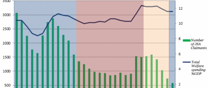
Chart of the Week: Week 51, 2016: Number of JSA Claimants v.s. Total Welfare Spending
The chart demonstrates the variation in welfare spending under each successive UK government.
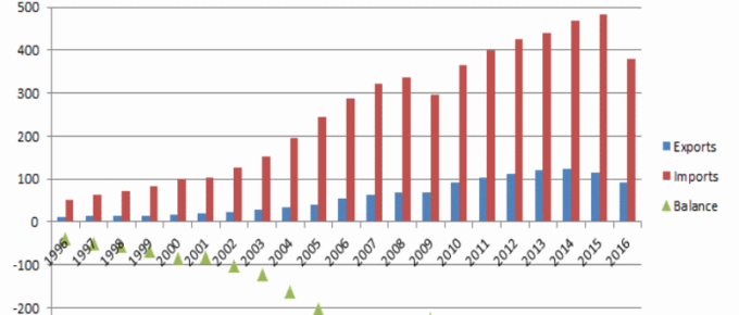
Chart of the Week: Week 50, 2016: US Trade in Goods with China
The chart demonstrates the extent to which the two countries’ economies are intertwined and the enormity of the US trade deficit with China, which has only increased in the last two decades.
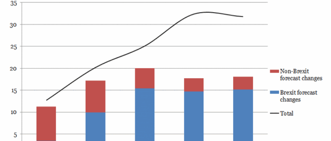
Chart of the Week: Week 49, 2016: Impact of Forecasting Changes on Borrowing
The Office for Budget Responsibility has projected that the Brexit bill will be £60bn over the next five years as a result of lower growth and weaker tax returns.