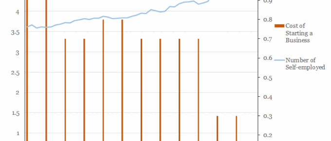
The chart shows that a correlation exists between the number of people taking up self-employment and the cost of starting a business in this country.
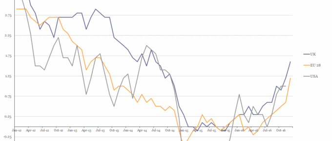
Chart of the Week: Week 6, 2017: USA, EU28 and UK Inflation
The chart shows that in 2016 the HICP rate of inflation for all three parties rose above 1% for the first time in over 2 years.
February 2017
The economic dislocation following the financial crisis is receding and business in general seems to have adjusted to a world of growing uncertainty on the political as well as the legislative front. Perhaps…
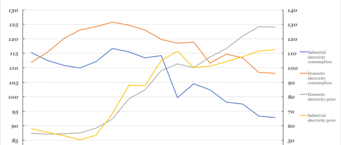
Chart of the Week: Week 4, 2017: Historical Electricity Prices vs Consumption
In this chart we can see that from 2000, consumption by both industry and the public has declined. The price of electricity supplied to both domestic and industrial sectors has risen significantly.
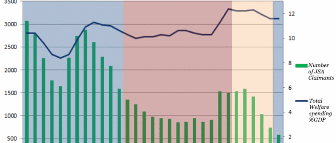
Chart of the Week: Week 51, 2016: Number of JSA Claimants v.s. Total Welfare Spending
The chart demonstrates the variation in welfare spending under each successive UK government.
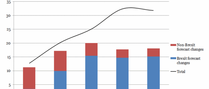
Chart of the Week: Week 49, 2016: Impact of Forecasting Changes on Borrowing
The Office for Budget Responsibility has projected that the Brexit bill will be £60bn over the next five years as a result of lower growth and weaker tax returns.

