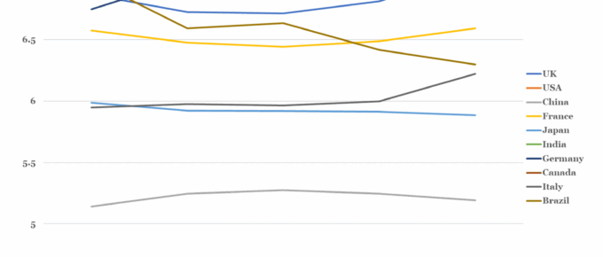
Out of the countries shown, the UK is perhaps the most confounding. Over the data period it has experienced significant political upheaval and societal division, centered around the Brexit vote. In 2016, the statistics suggest that Britain actually became happier and has remained on this trend until the end of the data period…
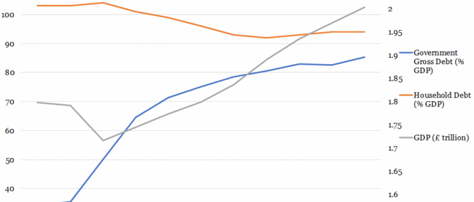
Chart of the Week: UK Government & Household Debt vs. GDP
Over the past 40 years, government debt as a proportion of GDP has predominantly remained in the 30%-50% range. This trend ended with the financial crisis, after which government policy has been centered on reducing the debt to GDP ratio…
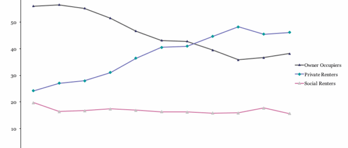
Chart of the Week: Week 17, 2017: Households of 25-34 year-olds by Tenure
The chart shows that 2011/12 marked the point that home-owning 25-34 year olds were no longer in the majority, surpassed by those that rent privately.


