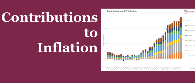
Summary October’s headline inflation rate of 11.1% was largely led by two groups: Housing, water, electricity, gas and other fuels, and Food. This week’s chart assesses the drivers behind these groups, to judge their likely trajectory into 2023. What does the chart show? The chart shows the contribution to the overall year-on-year rate of inflation […]
Chart of the Week
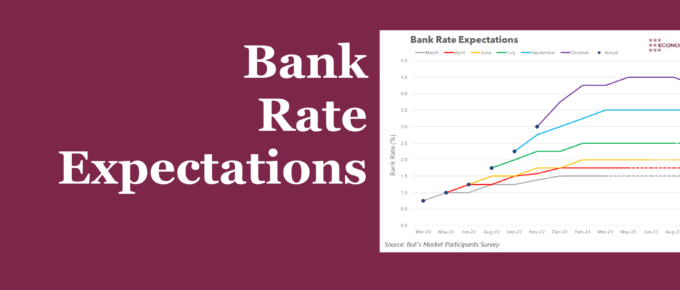
Whilst high inflation has been with us since 2021, the economic atmosphere has certainly changed through the year. This week’s chart assesses Bank Rate expectations over time to see what they tell us about the economy.
Chart of the Week
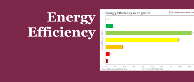
Whilst efforts have been made to improve efficiency, they have often ended in failure. A coordinated and committed approach is needed to reduce reliance on fossil fuels, and lower household bills.
Chart of the Week
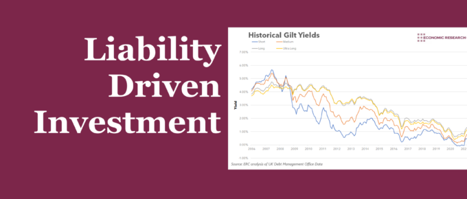
Summary Financial markets have been in crisis mode ever since the budget. Institutions called on the bank of England to step in, which they did, but were we ever any close to a catastrophe? This week’s chart analyses the impact that instability in the bond market had on defined-benefit pension funds. What does the chart […]
Chart of the Week
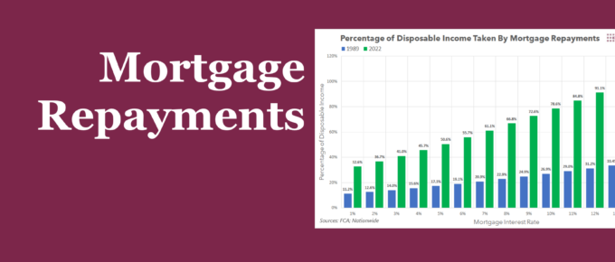
Summary When faced with the prospect of rising interest rates, some have dismissed the potential pain it will cause by arguing that rates were much higher in the 80s and 90s. This week’s chart compares the impact on living standards that high mortgage rates had on homeowners in the late 80s to the present day, […]
Chart of the Week
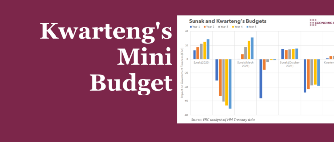
Summary Kwasi Kwarteng announced a range of fiscal measures, which set a clear tone for what we are likely to see from the current government. These measures largely consisted of tax cuts. Whilst they are likely to hurt government finances, their announcement clearly shows the priority that this government places on supply-side policies. What does […]

