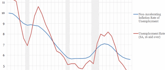
One of the prevailing narratives in economics over the past few decades has been the stifling of wage growth. The NAIRU provides an interesting lens through which to gauge labour market slack. The recent decreases….
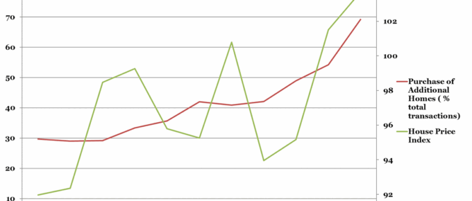
Chart of the Week: Historical Chinese Residential Property Market Trends
It would be unremarkable were house prices increasing as a function of total home purchases,
however, this graph shows that the key driver of HPI rises is not the fundamental demand for
housing. Rather it is in response to…

Next Event: ‘Your Property: Boom or Bust?’ – 23rd October 2018
This year’s event will once again feature expert speakers who shall each offer a different perspective on the property market…
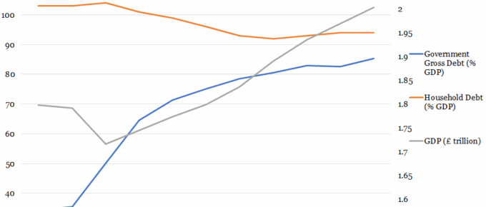
Chart of the Week: UK Government & Household Debt vs. GDP
Over the past 40 years, government debt as a proportion of GDP has predominantly remained in the 30%-50% range. This trend ended with the financial crisis, after which government policy has been centered on reducing the debt to GDP ratio…
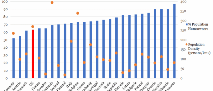
Chart of the Week: European Home Ownership vs Population Density
Considering that Germany has the lowest home ownership rate, relatively high population density and yet is acknowledged globally as one of the most prosperous European economies; their housing market…
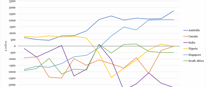
Chart of the Week: UK Trade Balance with Largest Commonwealth Economies
Already existent strong trade ties between neighbouring nations could potentially prove limiting for Britain’s trade expansion …