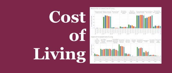
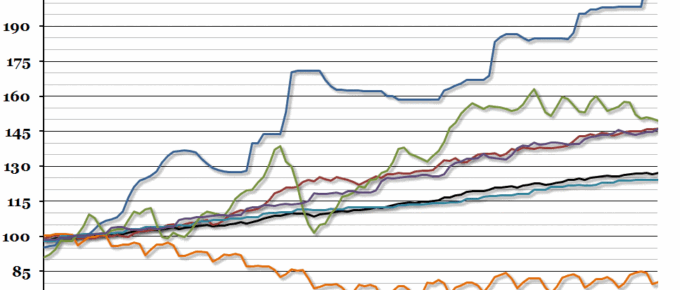
These statistics combine to emphasise the mantra that many people are choosing between “heating and eating”.
Chart of the Week
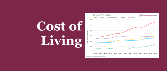
Summary In the past year, people in the UK have experienced larger than normal increases in the cost of living, with some categories of goods having as high as a 14% increase. Skyrocketing gas prices are making logistics, transportation, and energy extremely more expensive. The lorry driver shortage has played a part in this and […]
Chart of the Week
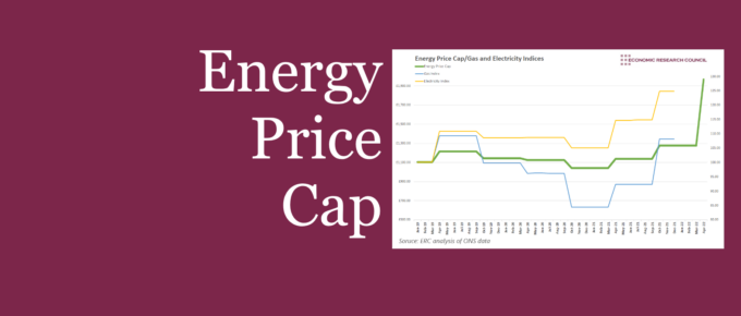
This week, we present a series of charts to examine the price cap, the measures put in place, and what they mean for households.
Chart of the Week
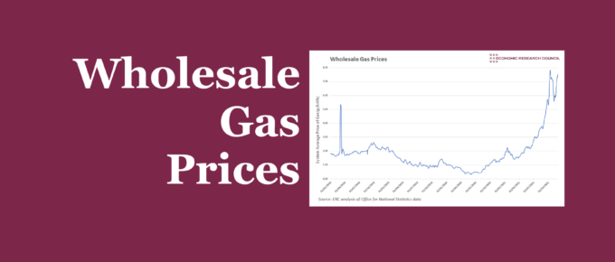
The raising of the energy price cap has attracted a lot of attention and may have assisted in keeping some smaller providers in the market. This week’s chart analyses wholesale gas prices, and what the future may hold if prices continue to rise.
Chart of the Week: Week 14, 2014: Cost of Essentials
After last week’s chart on wages compared to inflation, we received plenty of correspondence asking whether CPI is the best measure for the cost of living.

