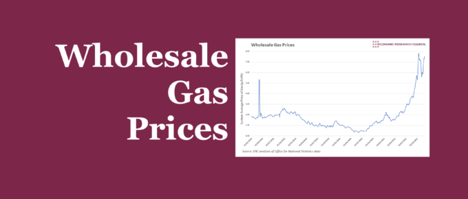
The raising of the energy price cap has attracted a lot of attention and may have assisted in keeping some smaller providers in the market. This week’s chart analyses wholesale gas prices, and what the future may hold if prices continue to rise.
Latest Blogposts

ERC Webinar Series: COP26 Debrief with Simon Mundy
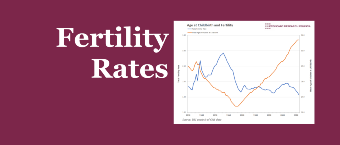
Chart of the Week
Fertility rates are at historic lows whilst the average age of childbirth has been on the rise since the 1970s. This week’s chart assesses the likely effect of this on individuals and society.
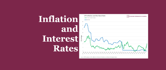
Chart of the Week
This week’s chart questions the extent to which the Bank of England sees interest rates as a useful in tackling cost-push inflation.
The 2021 Clash of the Titans Event
Monday 13th December, 7pm, online.
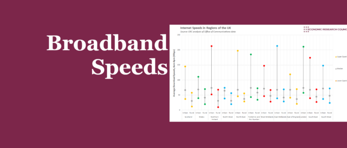
Chart of the Week
Project Gigabit is scheduled to roll out fast broadband connections to remote locations in the UK. The chart shows that certain areas are in desperate need of it.