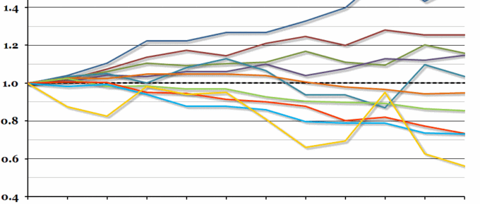
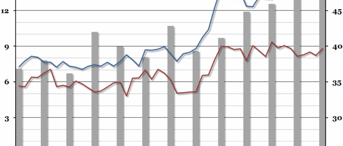
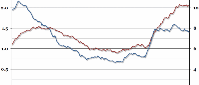
The Office for National Statistics’ annual household spending report came out last week, so this week’s chart is on how household spending has changed over the past decade (just in time for Christmas).
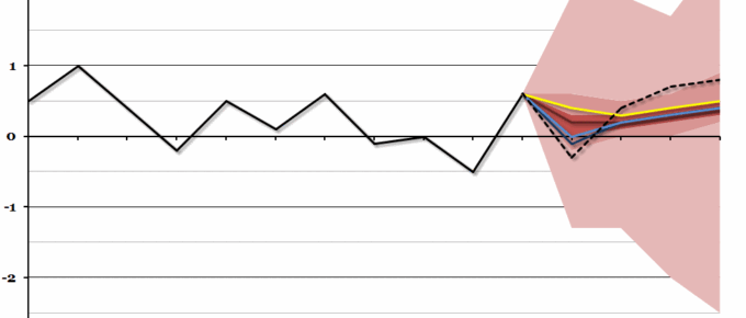
Chart of the Week: Week 50, 2013: UK Average Earnings Forecast
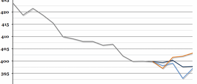
The Economic Research Council’s third annual Clash of the Titans was held last night, and we received three sets of forecasts from three leading economic thinkers (you can see their forecasts in full here).
Chart of the Week: Week 49, 2013: Clash of the Titans
As the annual Clash of the Titans economic prediction competition is taking place next week on the 10th December, we’ve taken a look back at last year’s forecasts.
Chart of the Week: Week 48, 2013: Public Sector Finances
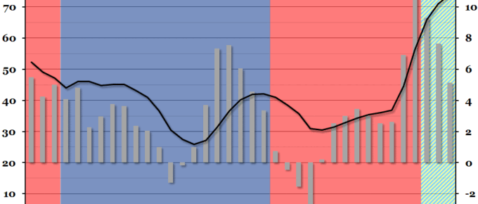
Public sector finance figures were released at the end of last week, showing that net borrowing had decreased in the financial year 2012/13.
Chart of the Week: Week 47, 2013: The Graduate Labour Market
Summary Following on from our chart last week on underemployment, this week we looked at the interaction between recent graduates and young non-graduates in the labour market, courtesy of a recent ONS report. What does the chart show? The red and blue lines show the unemployment rate (the percentage of people within a group that […]
Chart of the Week: Week 46, 2013: Underemployment
The unemployment rate over the past three months fell to 7.6%: the lowest point since the first half of 2009.

