Summary
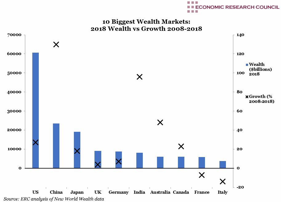
The chart shows that the USA retains its position as the wealthiest country by far with a total wealth market of nearly $61 trillion. The United States possesses as much wealth as China, Japan, the UK and Germany combined. Germany has shown the strongest growth of the European nations at 7%, with the UK wealth market only growing 4% during the period shown. This is interesting nonetheless, given that the UK has approximately three quarters the population and 70% of the total GDP of Germany. Unsurprisingly the last decade has shown breath-taking growth for the wealth market in China and India, 130% and 96% respectively. What is perhaps is surprising is the story in Australia, where the wealth market has grown by 48% in the decade shown, despite a population of only 25 million. Japan’s high saving rate is reflected in the 18% growth of its wealth market, despite relatively flat economic growth in the same period. The wealth markets in Italy and France are the only two to have contracted in this period by 14% and 7% respectively. In France this is potentially a product of wealth taxes, some of which were scrapped in 2017. Italian markets have suffered in the last decade relative to its European competitors.
What does the chart show?
The bars display the total size of the wealth market in each of the named nations in billions of USD, measured against the left hand axis. These constitute the ten largest wealth markets globally. The figures exclude government funds and are calculated by the total of private wealth held by all individuals residing in the country. This includes the sum of all their assets, less any liabilities (cash, property, equities and business interests). The markers are measured against the right hand axis and represent the total percentage growth in wealth market size from December 2008 to December 2018. In the cases of Italy and France, the number is negative.
Why is the chart interesting?
Global private wealth in 2018 totalled $204 trillion and stands at $27 thousand per person on average, although this is obviously distributed very unevenly. In 2018 there were 14 million high net worth individuals globally (wealth of over $1 million) and some 2,140 billionaires. Despite technology advancements, geopolitical instability over the last decade has seen a 65% reduction in capital flows across borders.
Although the UK, Australia and Canada have each seen large increases in household debt to income ratios, their wealth markets have been bolstered by the baby-boomer generation who have seen the values of their assets soar. In the UK particularly, the issue of inequality has received a great deal of coverage recently following a damning UN report into poverty in the country following austerity. This is far from a UK only problem, for example in Australia, although average per capita net wealth (adjusted for inflation) is almost one third higher than pre-crisis, in 2017 the richest decile of Australians were holding 48.3% of this, a slight increase on 2007 figure of 46.8%.
As much as one could look to political differences or motivations, the single biggest boon for wealth growth has been global loose monetary policy with near zero interest rates and significant QE, which serves to boost asset prices. China’s fiscal stimulus has been the biggest in economic history. France and Italy’s wealth markets have likely suffered from the policies of free movement of people and capital, where high net worth individuals have little requirement to reside where their capital is held within the European Union.
China is quite unusual among the nations on the chart, for a variety of reasons. Where the other nations have succeeded in vastly enriching a relatively small number of individuals who skew the average, China has brought a vast number of its citizens into its middle class. For example, the differential between median and mean wealth in China is 2.8 and when compared to its fastest growing neighbour, India, this figure is 5.5; in Europe the differential is 8 and in North America it is 6.
Week 21, 2019

