Summary
There has been a lot of new data released this week on the Euro Area, and all of it has been positive; unemployment continues to fall (slowly), inflation is back up to closer to 0%, and economic confidence is at its highest since 2011. We’re a long way from normal, but things are starting to look up.
What does the chart show?
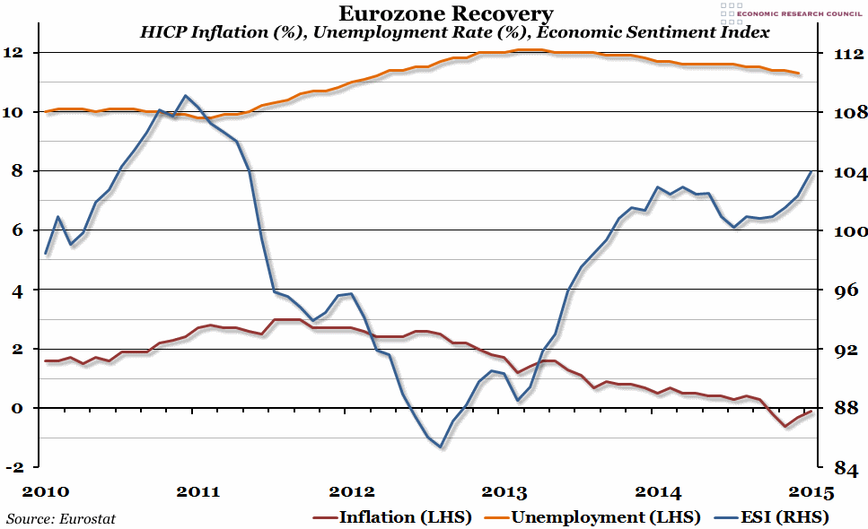
Three indicators are included in this graph. The blue line, measured against the right hand axis, is the European Commission’s Economic Sentiment Indicator. This is a survey of economic confidence, with a score of greater than 100 meaning people are feeling better about the economy than average. The orange line, measured against the left hand axis, is the monthly unemployment rate (the percentage of people currently available to work who do not have a job). Finally, the red line is the percentage growth of the monthly HICP measure of inflation compared to the same month in the previous year, also measured against the left hand axis.
Why is the chart interesting?
Two years ago, the situation looked bleak for the Eurozone. Unemployment had peaked at over 12% and was remaining stubbornly high, inflation was lower than other developed economies (mainly due to suppressed demand), and economic confidence was painfully low. The rhetoric in the Euro Area may have remained gloomy, but there has been a quiet revival in the economy since then. Unemployment has finally started to come down (although it remains unacceptably high, at least it is travelling in the right direction). Inflation reached its trough at -0.6% in January, but has recovered in the two months since then, and Eurostat reported it was -0.1% in March (hopefully reflecting stronger demand). Finally, economic sentiments have been growing strongly since the end of last year, and are now at the highest they’ve been since the Summer of 2011.
However, the nascent recovery is still very fragile, and could easily be derailed by political crises – whether that is the threat of Russia or a Greek exit.

