Summary
Following on from our graph recording the impressive US recovery a fortnight ago, this week we have taken a look at the much more limited recovery in the euro zone.
What does the chart show?
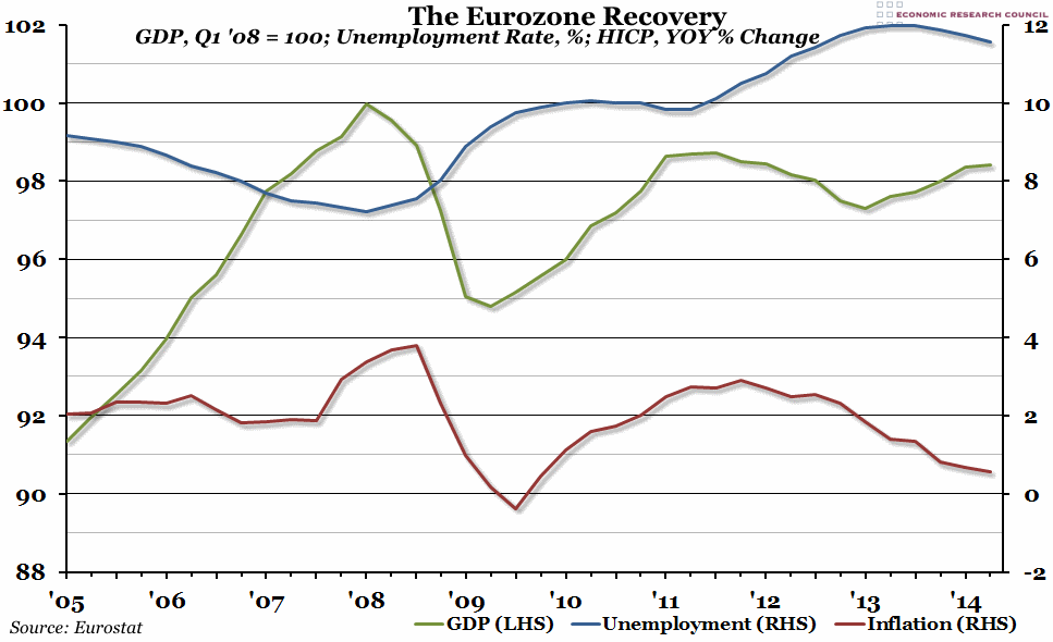
Three indicators are included in this graph. The green line, measured against the left hand axis, is quarterly Gross Domestic Product (GDP), indexed so that the pre-recession peak (in the first quarter of 2008) is equal to 100. The blue line, measured against the right hand axis, is the monthly unemployment rate (the percentage of people currently available to work who do not have a job) averaged over each quarter. Finally, the red line is the percentage growth of the monthly HICP measure of inflation compared to the same month in the previous year, also averaged over each quarter and measured against the right hand axis.
Why is the chart interesting?
The euro area economy has performed very differently when compared to that of the US over the past decade. GDP growth in the euro zone was stronger in the years leading up to the crisis than it was in the US, but Europe also experienced a deeper, longer recession. In fact, the euro area as an aggregate has still not reached the pre-crash peak in output from 2008. Price changes have been less dramatic in the euro area, but the same general pattern is clear: a peak in inflation immediately after the recession, followed by a crash and a brief period of deflation, and then a “hump” which we now seem to be over.
Finally, unemployment: it has been consistently higher in the euro area than in the US, even before the crisis hit. More importantly, it hasn’t shown much sign yet of recovering at all, peaking at 12% during 2013. The problems which the Americans seem to have largely overcome – namely slow growth and high unemployment – are still very present in Europe.

