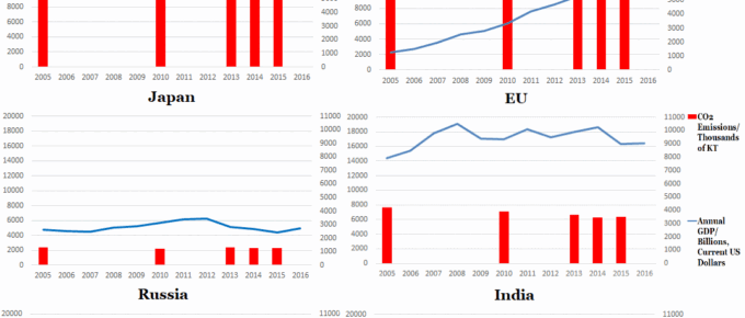
The set of graphs generally indicates that developed countries are beginning to reduce their emissions, whereas India and China are seeing their emissions rise, as they undertake vast infrastructure projects and continue to lift sizeable populations out of poverty.
August 2017
I have outlined many confusing issues, the world economy in general is chugging along nicely in spite of everything. People and businesses are getting on with running their affairs and the steady, albeit slow, growth…
May 2017
In the UK, the Prime Minister sprung a completely unexpected election. On analysis,
it was called for understandable reasons, however, it was a brave move. The Prime
Minister’s negotiating position…
March 2017
Since my thoughts at the beginning of February, which followed a few intensive days in Washington DC, nothing has happened to change my view of Trump. He is, however, proving…
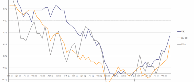
Chart of the Week: Week 6, 2017: USA, EU28 and UK Inflation
The chart shows that in 2016 the HICP rate of inflation for all three parties rose above 1% for the first time in over 2 years.
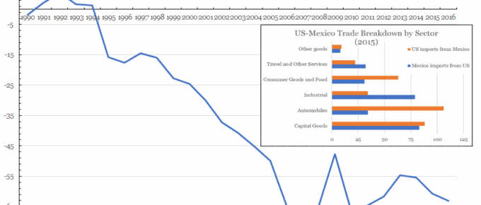
Chart of the Week: Week 5, 2017: US Trade with Mexico
The chart shows that the US has been in trade deficit with Mexico since Clinton came to power, with George Bush Jnr presiding over the period with the largest deficit increase; around $29 billion.


