Data gathering technology that is already embedded in your mobile telephone and algorithms could in the near future predict that when you leave a meeting or a restaurant, you will need a taxi to take you to your next destination and it will be waiting ….
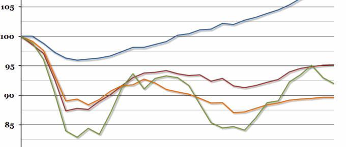
Chart of the Week: Week 22, 2015: UK GDP Growth by Sector
Contrary to most economists’ expectations, the overall growth rate in the first quarter of this year remained unchanged last week, at a disappointing 0.3% (most people had expected it to be revised upwards).
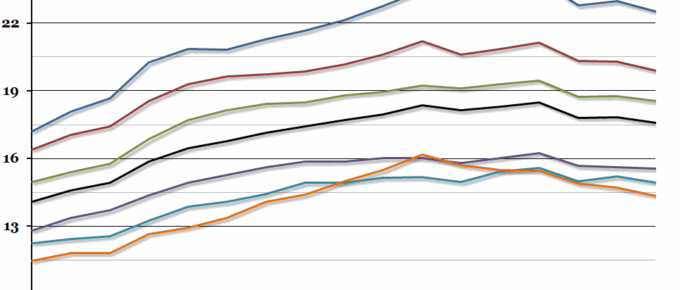
Chart of the Week: Week 21, 2015: UK Regional Disposable Income
This morning, the ONS released a long-term data series on regional household gross disposable income, which showed that the gap between the richest and poorest regions in the UK had opened up slightly.
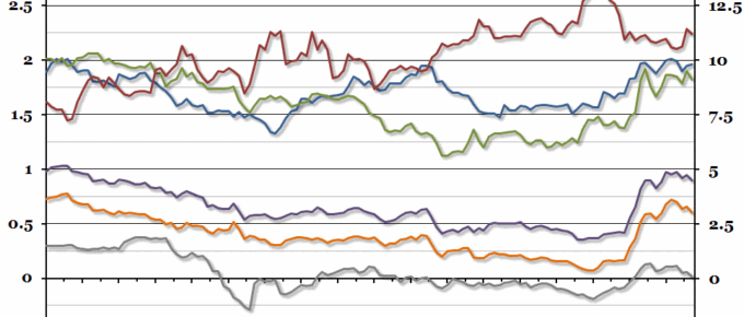
Chart of the Week: Week 20, 2015: European Government Bonds
There have been some interesting movements in the European government bond markets over the past 6 months, ranging from incredible negative yields on 10 year Swiss bonds through to almost 14% yields on Greek bonds.
Chart of the Week: Week 19, 2015: UK Historical Inflation
Next week, Pete Comley is coming to speak to the ERC on “Inflationary Wave Theory”.
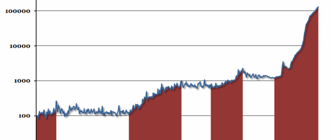
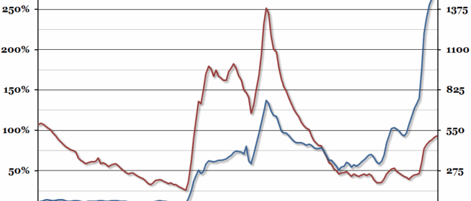
Chart of the Week: Week 17, 2015: Historical UK Government Debt
Public sector finance data for the financial year 2014/15 was released at the end of last week, so we’ve updated our annual chart tracking historical UK government debt over the last 160 years.


