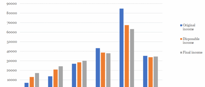
The chart shows that average disposable household income for the top quintile of UK households stands at over £67,000 and that of the poorest quintile is just over £13,000, more than 5 times lower.
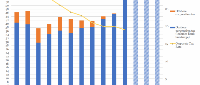
Chart of the Week: Week 21, 2017: Corporation Tax Rates v.s. Receipts
The chart shows that, despite consistent reductions in the taxation rate, yearly receipts of corporation tax have remained relatively stable over the last decade.
May 2017
In the UK, the Prime Minister sprung a completely unexpected election. On analysis,
it was called for understandable reasons, however, it was a brave move. The Prime
Minister’s negotiating position…
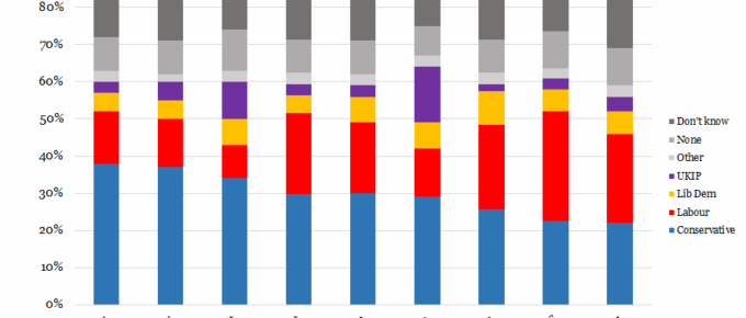
Chart of the Week: Week 15, 2017: UK Voter Sentiment on Key Issues
The chart shows that the Conservative Party enjoys the majority of support across 7 of 9 issues, with Labour support exceeding the Tories’ only on NHS and Housing.
Chart of the Week: Week 13, 2017: Gender Pay Gap by Country
This Tuesday 4th April was ‘Equal Pay Day’, a date symbolically chosen in the USA for two reasons: it roughly represents the date when the average woman would need to work to, from 1st of January 2016, to match the average man’s 2016 earnings.
March 2017
Since my thoughts at the beginning of February, which followed a few intensive days in Washington DC, nothing has happened to change my view of Trump. He is, however, proving…


