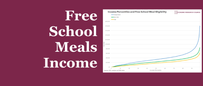
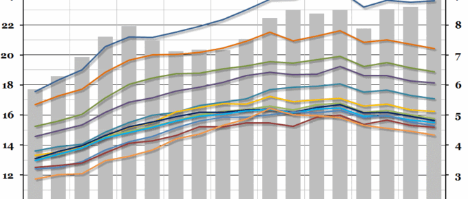
The earnings gap between the advantaged and disadvantaged is often explained using educational attainment, though this week’s chart questions whether more is at play.
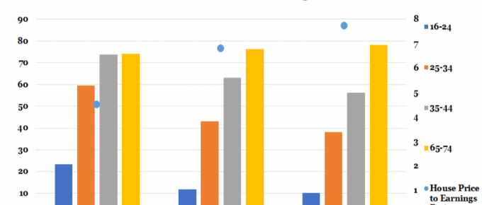
Chart of the Week: 20th June 2018: Home Ownership vs House Price to Earnings Ratio
Last year saw the emergence of five London boroughs where houses ‘earned’ more in a year than their owners; most starkly in Barnet, where on average home-owners earned £54.6k net whereas their homes grew in value by nearly £107k.
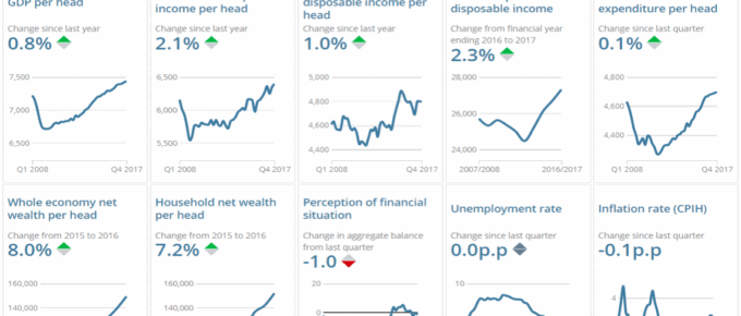
Chart of the Week: June 2018: Explore Changes to the UK Economy
The charts show key changes in the UK economy… click to find out more!
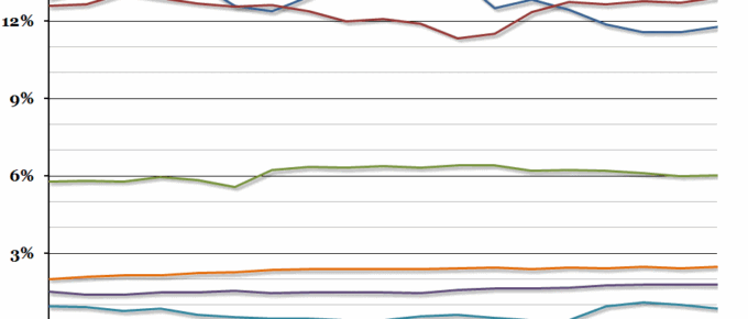
Chart of the Week: Week 25, 2016: UK Government Revenue
Yesterday, the Office for National Statistics released updated figures for the UK government finances in the financial year 2015/16.
Chart of the Week: Week 21, 2016: Regional Disposable Income
Data released by the ONS this morning showed that the gap in gross disposable income between the richest region of the UK (London) and the poorest (Northern Ireland) opened up to the largest it has been since records began in 1997.

