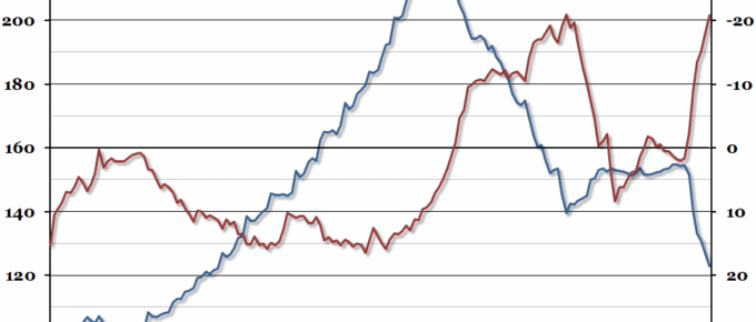
Last week, while discussions over a possible Greek bailout agreement were stalling, the Bank of Greece quietly released their monthly figures for bank deposits.
Chart of the Week: Week 25, 2015: UK Services Growth by Sector
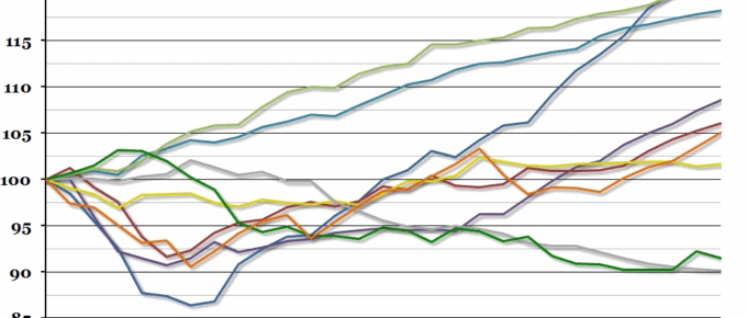
A few weeks ago, we produced a chart which showed how the UK service sector is outperforming other sectors and dragging GDP growth up.
Chart of the Week: Week 24, 2015: Employment and Earnings
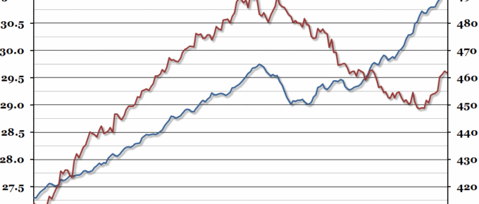
After peaking at a new record level in March, total employment levels fell very slightly in April (but the trajectory remains promising), while real earnings have recovered somewhat in the last year.
Chart of the Week: Week 23, 2015: UK House Prices
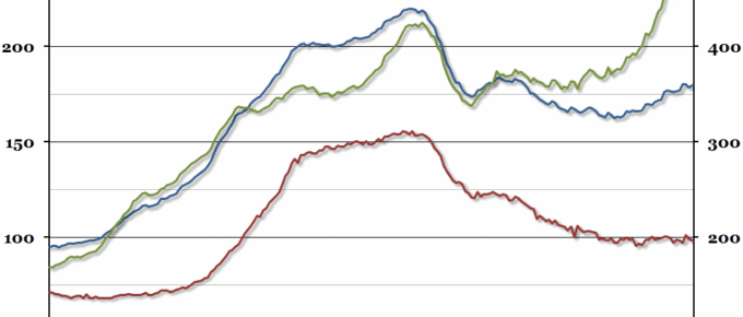
The Land Registry published their data on average house prices for April recently, and they showed that although the average price grew by just over 5% in nominal terms, this was the slowest annual growth rate since January 2014.
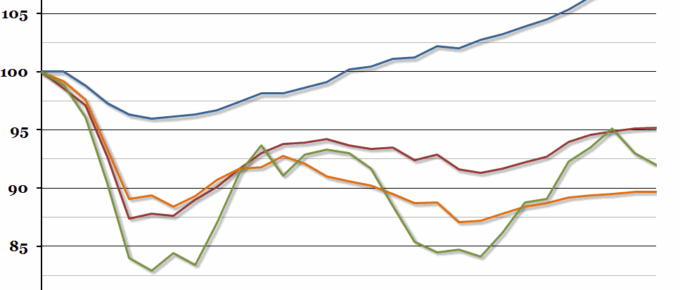
Chart of the Week: Week 22, 2015: UK GDP Growth by Sector
Contrary to most economists’ expectations, the overall growth rate in the first quarter of this year remained unchanged last week, at a disappointing 0.3% (most people had expected it to be revised upwards).
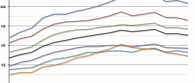
Chart of the Week: Week 21, 2015: UK Regional Disposable Income
This morning, the ONS released a long-term data series on regional household gross disposable income, which showed that the gap between the richest and poorest regions in the UK had opened up slightly.

