Summary
The International Monetary Fund (IMF) release their twice yearly World Economic Outlook report in April, and it contains a great deal of data and forecasts. We’ve taken their growth forecasts for a number of advanced economies to show the variation in growth since 2010.
What does the chart show?
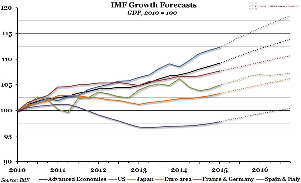
The chart shows an index of GDP growth, rebased so that Q1 2010 is equal to 100, for a number of different economies. The solid lines represent out-turns, while the dotted lines are IMF forecasts. The black line represents the average growth for all “Advanced Economies”.
Why is the chart interesting?
This chart highlights the different outcomes for various advanced economies since the beginning of 2010. Over the period from 2010 to 2015, the US grew the fastest (by just over 12%), while the average advanced economy grew by just under 10%. France and Germany, taken together, grew strongly in 2010, but have been flat-lining ever since and are only just starting to show signs of recovery. More generally in Europe, you can see the clear double-dip recession in 2012/13, and Spain and Italy are still 2% below their 2010 output.
Looking at the IMF forecasts, the USA is expected to continue to grow strongly (although less fast than previously thought), while Spain and Italy are forecast to recover to their 2010 levels of output by the middle of 2016. Japan is the only advanced economy forecast to struggle in 2016, with growth stalling after a reasonable 2015.

