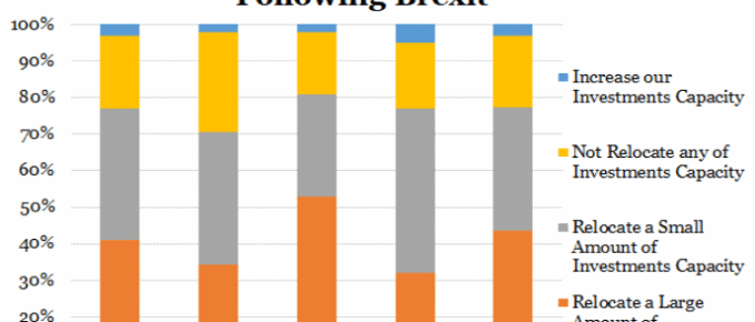
The chart shows a very pessimistic view of investment in the UK as a result of Brexit. On average, over three-quarters of companies headquartered in the displayed nations have stated their intention to move at least some of their investments out of the UK as a result of Brexit.
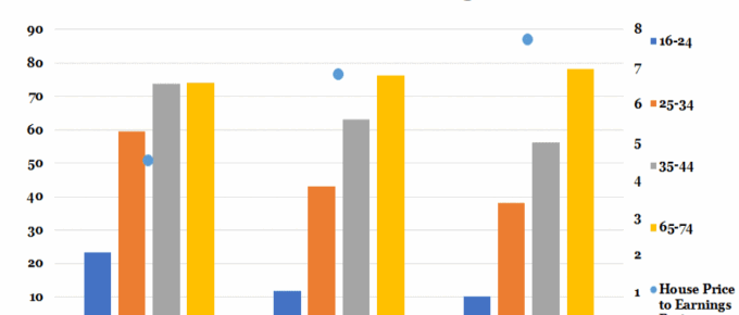
Chart of the Week: 20th June 2018: Home Ownership vs House Price to Earnings Ratio
Last year saw the emergence of five London boroughs where houses ‘earned’ more in a year than their owners; most starkly in Barnet, where on average home-owners earned £54.6k net whereas their homes grew in value by nearly £107k.
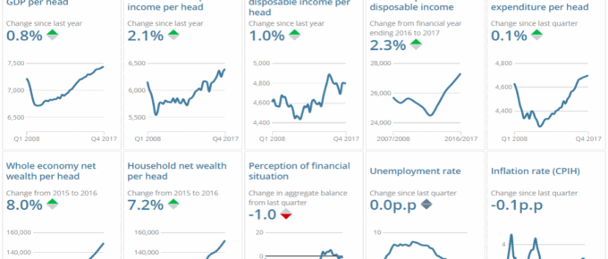
Chart of the Week: June 2018: Explore Changes to the UK Economy
The charts show key changes in the UK economy… click to find out more!