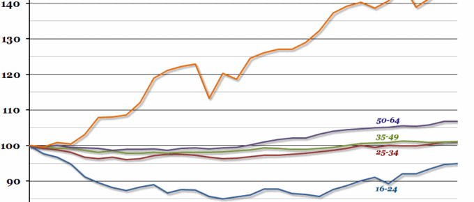
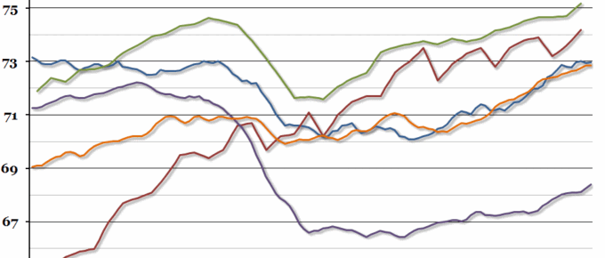
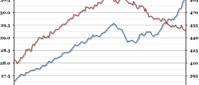
Roughly eight years have passed since the pre-crisis peak in employment, and there are almost 1.2 million more people in work today than in the three months between March and May 2008.
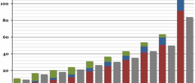
Chart of the Week: Week 8, 2016: UK Income Distribution
The Office for National Statistics released a report yesterday on household income for the financial year 2014/15.
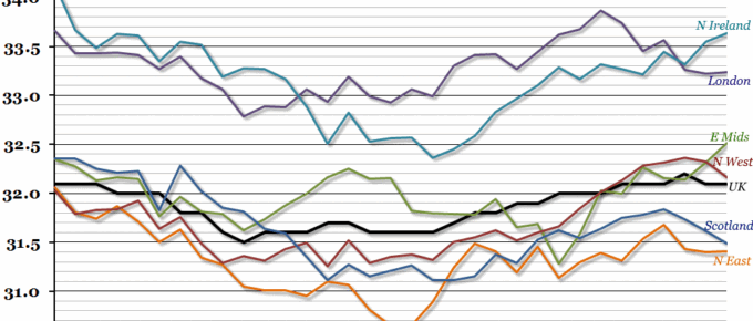
Chart of the Week: Week 7, 2016: Hours Worked by Region
According to today’s labour market report from the ONS, total hours worked in the UK reached a new peak in the final quarter of 2015.
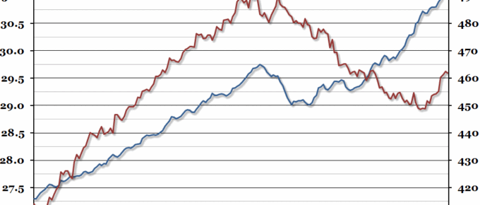
Chart of the Week: Week 24, 2015: Employment and Earnings
After peaking at a new record level in March, total employment levels fell very slightly in April (but the trajectory remains promising), while real earnings have recovered somewhat in the last year.
Chart of the Week: Week 3, 2015: Full Employment
David Cameron set out his aims for “full employment” this week, defining it as having a higher employment rate than other developed economies.
Chart of the Week: Week 29, 2014: Employment and Earnings
While the total level of employment in the UK continues to break records, real average wages are still declining steadily.

