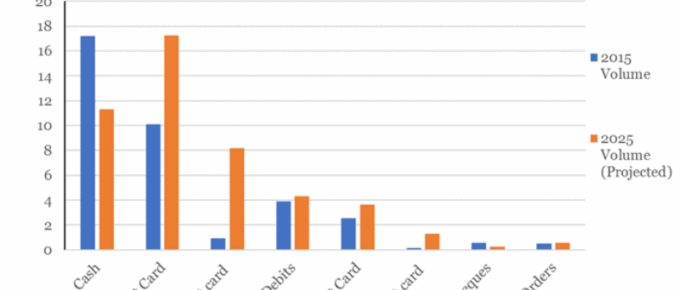
The chart shows that cash remains the most popular method of payment in 2015, although following a sustained downward trend, 2015 represents the first year in which under half (45%) of all consumer payments were made using cash.
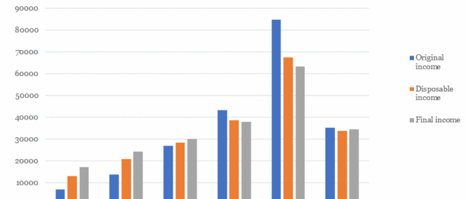
Chart of the Week: Week 22, 2017: Household Income Distribution
The chart shows that average disposable household income for the top quintile of UK households stands at over £67,000 and that of the poorest quintile is just over £13,000, more than 5 times lower.
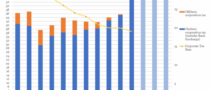
Chart of the Week: Week 21, 2017: Corporation Tax Rates v.s. Receipts
The chart shows that, despite consistent reductions in the taxation rate, yearly receipts of corporation tax have remained relatively stable over the last decade.
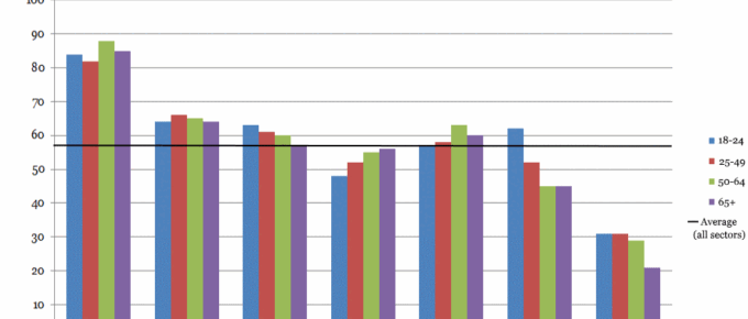
Chart of the Week: Week 20, 2017: Support for Nationalisation by Sector and Age Group
The public wants the NHS to stay in public control, but banks to stay private.
May 2017
In the UK, the Prime Minister sprung a completely unexpected election. On analysis,
it was called for understandable reasons, however, it was a brave move. The Prime
Minister’s negotiating position…
Chart of the Week: Week 19, 2017: Public Sector Receipts v.s. Spending
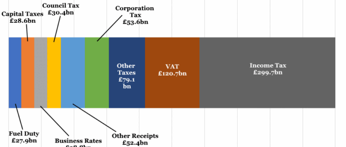
The current state of taxation receipts and public spending in the UK.

