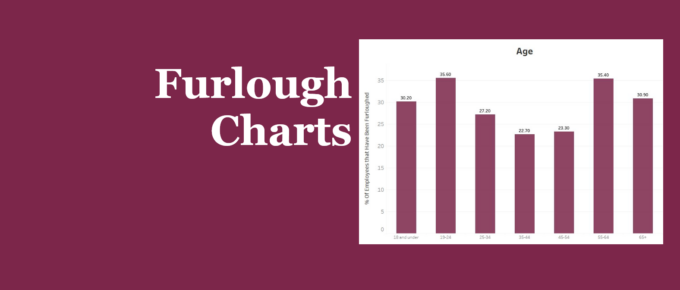
Our chart presents recent statistics on furloughed staff throughout the pandemic. Younger and older people were both more likely to be furloughed compared to those in between. Those with high levels of education have been less likely to be placed on furlough, while the industries that were most an least effected correlate with the extent they have been able to remain open through the pandemic.
Chart of the Week
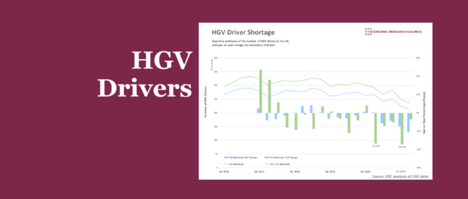
Supply chain issues in the UK have largely used Brexit and Covid-19 as scapegoats. The analysis presented below suggests that while these events have had an impact, we would still be facing shortages of HGV drivers if we had not left the EU and faced a global pandemic.
Chart of the Week
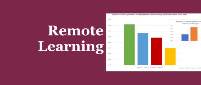
The majority, if not all students have felt a significant impact on their learning since the start of the pandemic. What has been less clear, however, is the magnitude of this impact. The chart sheds some light on those that have been hit the hardest.
Chart of the Week
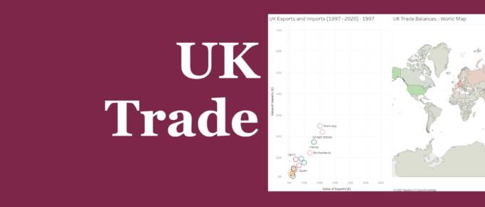
We invite you to explore the data to understand the characteristics of UK trade. Observe how patterns of trade have changed over time between the UK and key trading partners. Hover over each country to view the value of exports and imports, as well as the balance of trade.
Chart of the Week
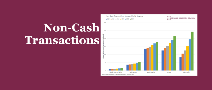
Ahead of our webinar ‘Unearthing the Import of the Payment System’ with Natasha de Terán, we look at the extent to which cash is being replaced by other forms of payment.
Chart of the Week
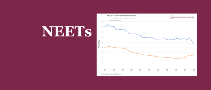
The turn of the year brought a rapid reduction in NEETs relative to general unemployment. Higher education has had a significant impact on this figure. Whilst employment in 16-24 year olds seems to play a part, a broader assessment presents concerning conclusions.

