This week, we present a series of charts to examine the price cap, the measures put in place, and what they mean for households.
The Outlook for the UK Economy
Wednesday 2nd March 2022, Geological Society, 6.30pm.
Chart of the Week
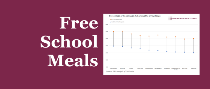
Tackling intergenerational poverty requires a holistic approach, encompassing factors within and outside of school.
Chart of the Week
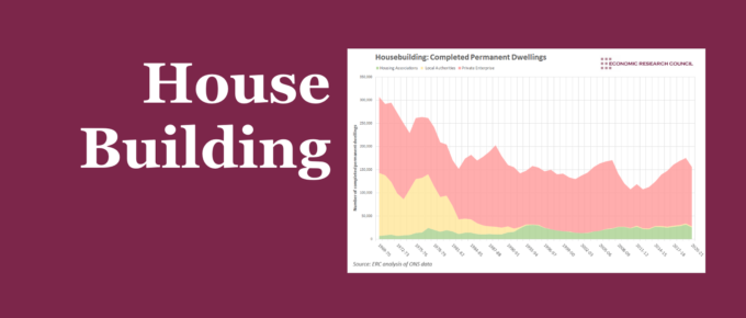
This week’s chart assesses how the supply of housing has changed over time, and the extent to which we can learn from the factors that have caused these changes.
Chart of the Week
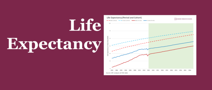
Life expectancy in the UK has been on an upward trend for decades. The 2010s challenged this, before the pandemic reversed it. The chart below discusses potential reasons for this.
Chart of the Week
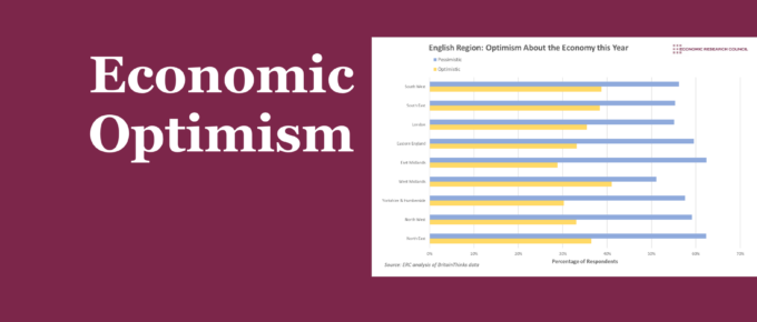
With our first entry of the year, Chart of the Week assesses the optimism of different sections of the UK on the economy over the year ahead.


