Summary
The Beveridge curve depicts the relationship between job vacancy rates and unemployment rates. Prior to the pandemic, a clear negative relationship existed between the two. The experience of 2020 challenged this relationship and seemed to indicate labour market inefficiencies, however, 2021 restored the correlation, albeit with a slight modification.
What does the chart show?
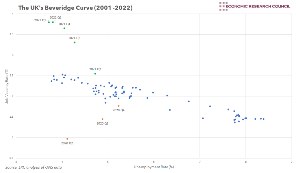
The chart shows the UK’s job vacancy rate plotted against the unemployment rate between 2001 Q2 and 2022 Q2. The job vacancy rate is the number of job vacancies as a percentage of the labour force. Together, the data develops the UK’s Beveridge curve, which depicts the relationship between job vacancies and unemployment. Blue dots represent job vacancy and unemployment rates between 2001 Q2 and 2020 Q1, whilst each orange and green dot has been labelled with its corresponding quarter.
Why is the chart interesting?
The Beveridge Curve is a handy way of showing the relationship between the vacancy rate and the unemployment rate. When a lot of unfilled vacancies exist, theory suggests that the rate of unemployment should be relatively low, as fewer people are available to fill these vacancies. Similarly, if unemployment is high, there should be a low number of vacancies to be filled. This results in a downward sloping curve. Furthermore, points on the curve represent points in the business cycle, whilst movements along the curve indicate changes in economic conditions. A period of high vacancy rates combined with low unemployment would suggest the economy is in an expansionary phase, but moving along the curve to the right would indicate a downturn, characterised by falling vacancies and increasing rates of unemployment.
When assessing the period between 2001 and 2020, our chart shows clear evidence for the theory behind the Beveridge curve; there is a clear negative correlation between the proportion of job vacancies and the unemployment rate. Moving into 2020, however, this relationship falls apart. The 4 orange data points to the bottom of the chart represent 2020 Q2 to 2020 Q4, the first three quarters after the onset of COVID. For each of these, we can clearly see that the unemployment rate is far lower than that predicted by the Beveridge curve in the 20 years prior to this. COVID and the associated restrictions substantially decreased the vacancy rate, but government support ensured that the unemployment rate did not spike in a manner that would have been expected. Interestingly, between 2020 Q2 and 2020 Q4, the negative correlation expected by the Beveridge curve was inverted, as the unemployment rate increased with the vacancy rate. Here, growing vacancies coupled with rising unemployment indicated that unemployed people were not getting these new job openings, an inefficiency in the labour market. Labour market inefficiencies are represented by rightward shifts in the Beveridge curve, which appears to be what was experienced in this period.
The period from the 2nd half of 2021 onwards seemed to restore the underlying relationship of the Beveridge curve. Generally, unemployment decreased as the vacancy rate increased. However, the steeper slope during this period suggests a slightly different relationship compared to the 2001 to 2019 period. Since 2021, larger increases in the vacancy rate have been associated with smaller decreases in the unemployment rate, compared to what had been experienced before. This may indicate that some of the labour market inefficiencies experienced in 2020 may still be present. Alternatively, it may be indicative of the fact that the economy reopened relatively quickly post Covid, with demand rapidly increasing. Combining this with artificially low unemployment as a result of government intervention could create the perfect environment for job vacancies to rise at a faster rate than the fall in unemployment.
By David Dike


