Summary
GDP is the most widely used economic statistic but holds inherent flaws. One of these is its failure to consider the informal economy. This week’s chart examines the global scope of the informal economy, and what that means for our use of GDP.
What does the chart show?
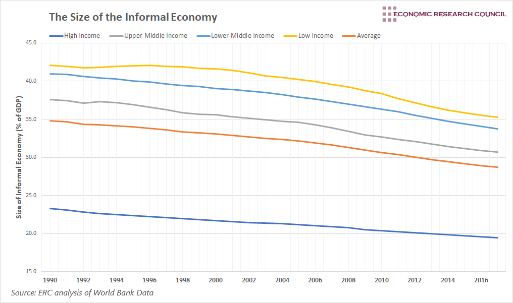
The chart displays the size of the informal economy for countries of different income levels. The size of the informal economy is measured as a percentage of GDP, whilst income levels are decided by GNI per capita according to the United Nations. In this chart, the informal economy represents the market-based, legal production of goods and services, that are hidden from public authorities. As such, it does not include illegal activities or household production such as familial childcare.
Why is the chart interesting?
GDP is the most widely used economic indicator around the world, guiding macroeconomic policymakers, and determining the success or failure of national economic initiatives. However, the chart goes a long way in highlighting one of its criticisms.
As is displayed, a significant proportion of economic activity occurs but is not captured by official GDP statistics in countries around the world. This issue is far more prevalent in lower-income countries, but it has by no means evaded higher-income countries. On average, the size of the informal economy was roughly 35% of GDP in lower-income countries, compared to around 20% for high-income countries in 2017. Due to this, reported GDP figures are incredibly inaccurate in accounting for the actual economic activity that has taken place within a country.
A high incidence of informal labour not only skews the calculation of GDP but can also have lasting effects on economic development. Firms operating in the informal space won’t contribute to the tax base, tend to be less productive, and have limited access to finance. Due to this, countries with large informal economies tend to exist below potential output.
The chart shows that since 1990, the relative size of informal economies has fallen in each income category, with the size of informal economies within low-income countries falling by around 9% of GDP on average. The declines occurred largely from the early 2000s, after a relatively constant (and sometimes rising) share of informal output. This period saw economic formalization in less developed countries, though the target of policy differed. Countries in Latin America and parts of Asia specifically targeted the informal economy, aiming to bring it into the open. At the same time, sub-Saharan African countries tended to focus on development, using formalization as a means of poverty reduction. Nevertheless, both approaches led to a sustained reduction in the share of GDP of the informal economy. The size of informal economies within high-income countries fell by around 5% over the same period, however, the largest declines occurred between the late 1990s and the global financial crisis of 2008-09. Since then, they have flatlined and partly reversed in some countries.
The fact that up to half of economic activity in a country can go unnoticed presents significant problems for policymakers. GDP is integral in the assessment of the economy when conducting monetary and fiscal policy for instance. Understanding the state of the economy helps policymakers target their decisions. A misunderstanding of this can lead to significant misallocations of resources.
An important consideration is that the chart above only accounts for the market-based, legal production of goods and services, that are hidden from public authorities. Including illegal activity inflates this figure, even before we consider the negative externalities that GDP fails to account for, as well as its inability to assess the sustainability of growth. Nevertheless, Ehsan Masood will join us next week to highlight these issues. You can find out more information about the event here.
By David Dike


