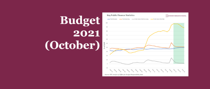
In light of the budget and spending review, we use a series of charts to take a deep dive into the key announcements, the Office for Budget Responsibility (OBR) forecasts, and what this means for UK plc in the upcoming years.

ERC Webinar Series: Unearthing the Import of the Payment System with Natasha de Terán
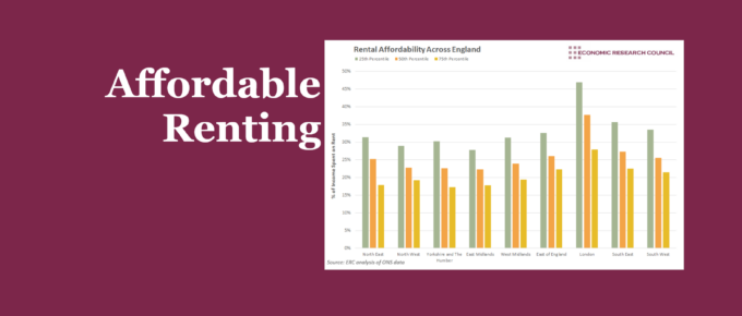
Chart of the Week
The extent to which can affordably rent varies considerably across the country, with London, naturally, being least affordable. We show that this isn’t just an issue for those on lower incomes.

Chart of the Week
Our chart presents recent statistics on furloughed staff throughout the pandemic. Younger and older people were both more likely to be furloughed compared to those in between. Those with high levels of education have been less likely to be placed on furlough, while the industries that were most an least effected correlate with the extent they have been able to remain open through the pandemic.