Summary
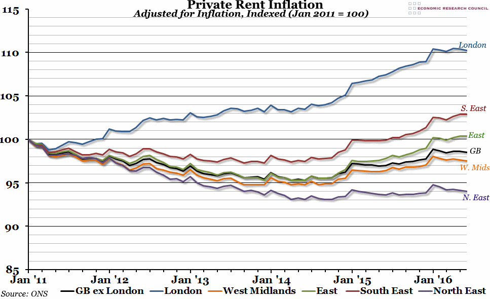
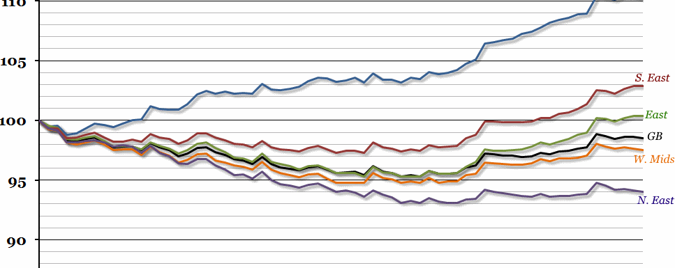
Over the past 5 years, rental prices in the UK on average have remained broadly stable. Within this, however, there has been significant regional disparity, with London growing by over 10% and the North East reducing by over 5%.
What does the chart show?
The chart shows a measure of real private rents, broken down by region, indexed so that January 2011 is equal to 100. The index is adjusted for inflation by the official CPI measure. Any figure over 100 means that rents have gone up in real terms, and vice versa.
Why is the chart interesting?
Rental prices are significant because they have a direct impact on disposable income, which drives private consumption, and in turn GDP. In areas where owner-occupied housing is less affordable, the alternative is to rent, so the cost of renting also has a large impact on people’s ability to fund house deposits. The chart illustrates that there has been significant regional disparity in rental price changes across different parts of the UK.
Outside of London, following a period of deflation from 2011 – 2013 rental prices have grown broadly in line with earnings. This contrasts with the pattern observed before the financial crisis, when earnings regularly grew above rental prices which meant consistent growth in household disposable income.
In London, rental prices have consistently grown above earnings. Despite this, the population of London grew by 135k in the twelve months to June 2016, showing that the attractions of living in London still outweigh the economic costs for a large number of people. Continued net migration is likely to further increase demand for rented housing, and put additional upwards pressure on prices. Although many think of the “housing crisis” in London in terms of home ownership, the increasing costs of renting in London remains a significant issue.

