Summary
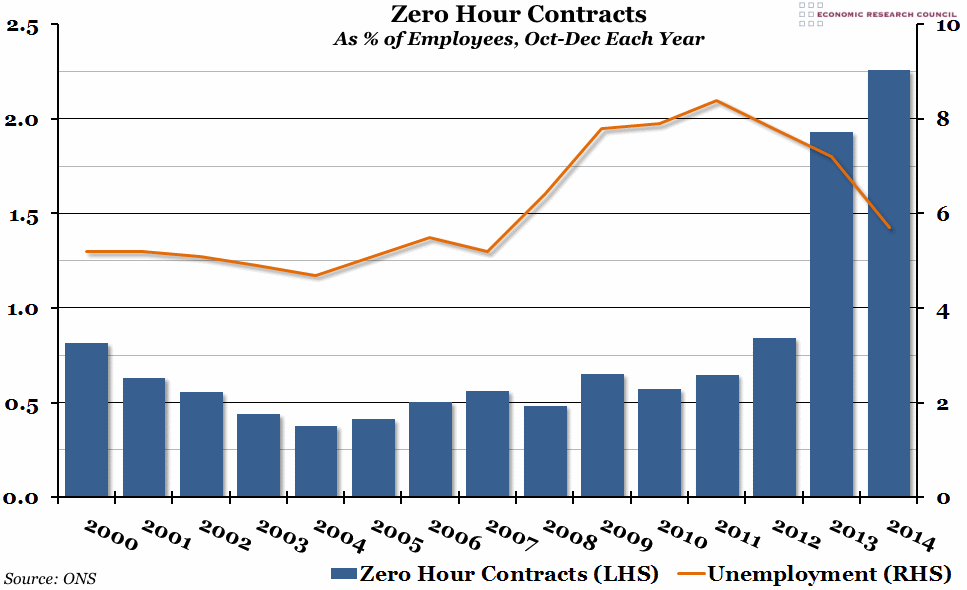
The Office for National Statistics published their annual survey of “Zero Hour Contracts” this morning, which suggested that the number of such contracts had grown to 697,000 in 2014, or 2.26% of all employees. It is clear that their prevalence has grown as unemployment has fallen.
What does the chart show?
The blue bars on the graph, measured against the left hand axis, show the percentage of all employees on zero hour contracts (where a person is not contracted to work a set number of hours, and is only paid for the number of hours that they actually work) in the final quarter of each year. The orange line, measured against the right hand axis, is the total unemployment rate (the percentage of people who are unable to find a job out of the total labour force) over the same period.
Why is the chart interesting?
Zero hour contracts have been in the news a lot over the last year or two, and this chart makes it clear why. Before 2013, they represented a small but fairly steady section of the labour force. Between 2012 and 2014, they have almost tripled in number as a proportion of all jobs. This is in contrast to the unemployment rate, which has fallen significantly over that period, and that suggests that a lot of the jobs that have been created recently have come with much less security and guaranteed pay.
Of course, there are some sectors where zero hour contracts make sense, and plenty of people may choose to enter into zero hour contracts due to their personal circumstances. However, 33% of people on zero hour contracts would like to work more hours (either in their current job or in a different one), compared to just 13% of people not on a zero hour contract. There is also some evidence that companies offering zero hour contracts will struggle to retain their employees as the labour market continues to improve: 16% of people on zero hour contracts are looking for new jobs, compared to 6% of all employees.

