Summary
The board of the US Federal Reserve meets today, and it is widely expected that they will announce a small increase in their target rate, taking it away from the rock-bottom range of 0 – 0.25% for the first time since late 2008. Their June projections suggest it could rise quite quickly after the first step is made.
What does the chart show?
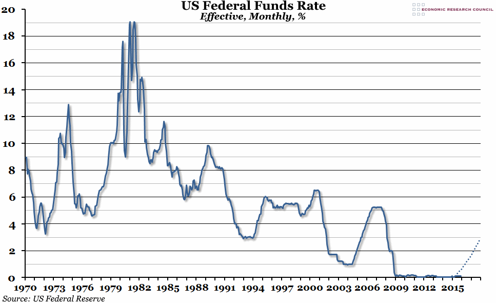
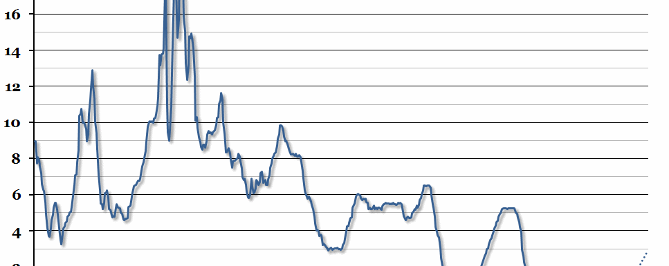
The chart shows the monthly average of the effective federal funds rate (the rate at which deposit-holding institutions lend to each other overnight) since 1970. The dotted line is the median forecast of the future path of the rate target, taken from the Federal Reserve Board’s Monetary Policy Report of July 2015.
Why is the chart interesting?
There have been several false alarms, but it is widely expected that today is the day that the US Fed will take the first step towards returning central bank interest rates to normal after an extended period of “emergency rates”. This week’s chart shows just how extraordinary the last few years of monetary policy have been in an historical context. The “norm” in the past has been well over 4%, and rates reached as high as 19% at the beginning of the 1980s. Although the target rate, set by the Federal Reserve, has officially been 0% – 0.25%, the effective rate has often been much closer to the lower bound than the upper one. However, the expectation among the policy makers is that once the small first step has been taken today (and it is likely to be a small step, with no serious economic consequences), the rate target could rise back up to almost 3% by the end of 2017. In the context of the last six years, that looks like fast movement.
The implications for the UK are that the Bank of England may follow suit once the US Fed makes their first move, and we will probably start to see the official Bank Rate edge up from 0.5% some time in 2016.

