Summary
This morning, the Scottish Government released their annual report on their finances covering the period up to 2013/14. A bad year for North Sea revenues has negated other improvements in the current budget position, and that was back when oil was selling for more than $100 per barrel.
What does the chart show?
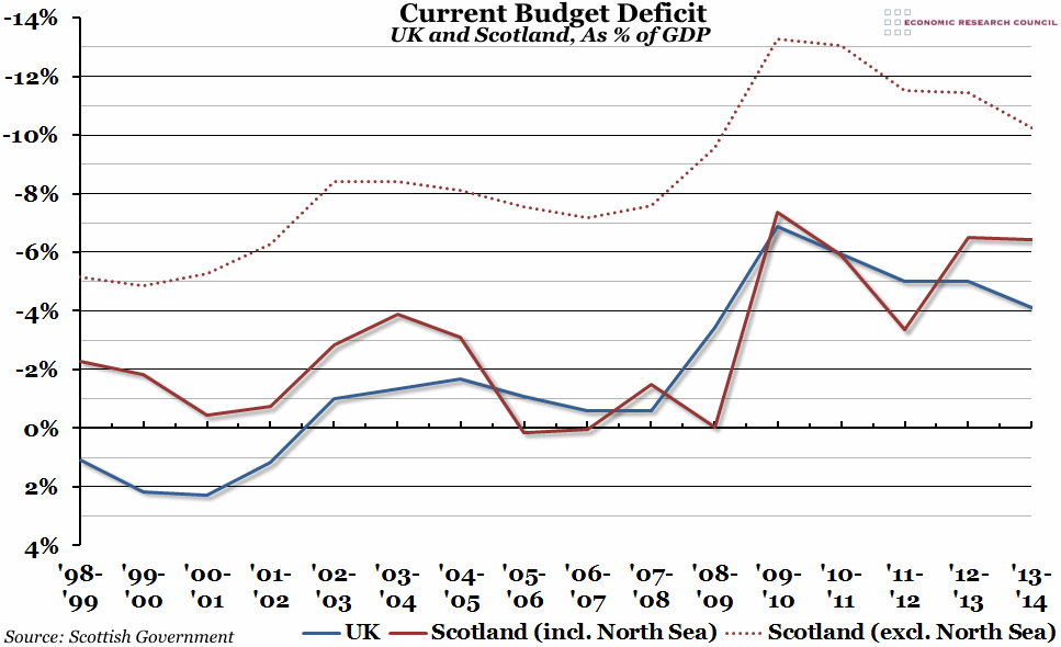
The blue line shows the current budget deficit (the difference between current revenue and current expenditure, excluding all capital spending) for the whole of the UK, as a percentage of GDP. The solid red line shows the same figure for Scotland alone, including the North Sea revenues allocated on a geographical basis, as a percentage of Scottish GDP. The dotted red line shows the Scottish figure excluding revenue from the North Sea.
Why is the chart interesting?
If you exclude all revenues from the North Sea, the Scottish budget deficit has closely followed the UK’s deficit, but with a 6%-7% gap (ie. the Scottish deficit has been consistently higher). However, that changes considerably when you include North Sea revenues, divided up on an indicative geographical basis. When oil and gas revenues are taken into account, the Scottish deficit is far more volatile, responding to changes in commodity prices. There is even a period in the mid-2000s when Scotland ran a small budget surplus (the UK as a whole at the time had a deficit).
However, as many oil-rich nations are now discovering, relying on oil revenues to cover a current budget deficit is not sustainable in the long-term. In 2013/14, revenues from the North Sea fell considerably as essential repairs and maintenance work cut into profits. This fall in revenue completely negated an improvement in the budget of more than 1%. It is important to remember that the oil price didn’t fall below $100 per barrel until August 2014, so low oil prices are not reflected in the chart above. Next year’s finances will almost certainly look considerably worse.

