Summary
EU unemployment figures released today highlighted the disparity between countries within Europe, as Germany posted a record low rate and Italy a record high.
What does the chart show?
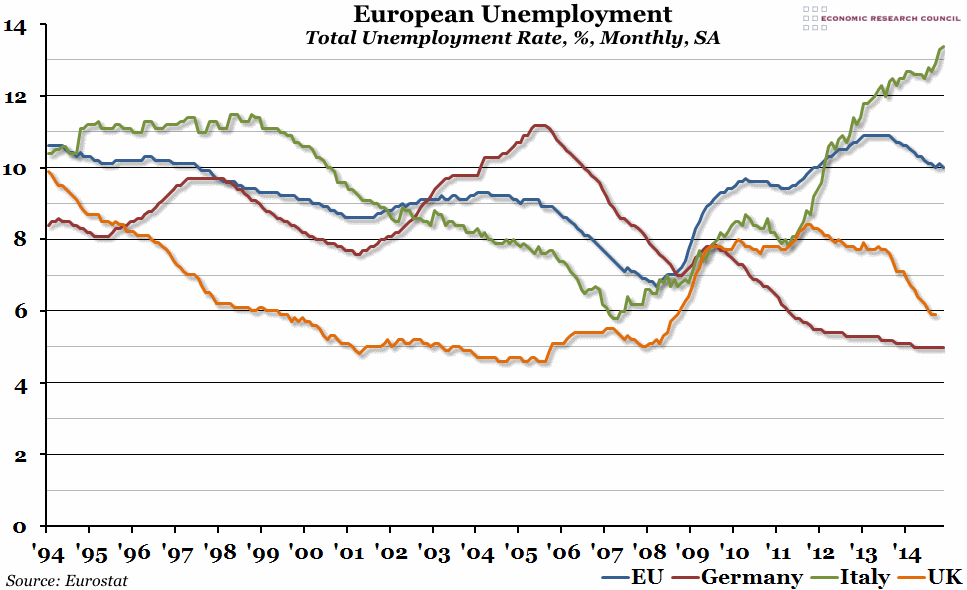
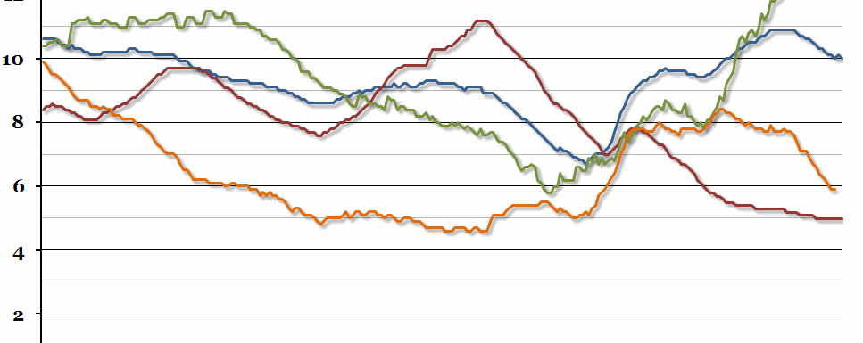
The chart shows the last twenty years of monthly data on the unemployment rate for Italy, Germany, the UK, and the EU. The unemployment rate is the percentage of the population who are available to work who do not currently have a job. The EU figure is the average for all countries within the European Union at the time indicated (so it includes more countries as time goes on).
Why is the chart interesting?
The headline European Union figure for November (the latest data) was 10% – a slight decrease on October, but the same as September – but that hides a lot of variation. This was most obviously highlighted by stories today that while Germany is currently experiencing its lowest unemployment since reunification (the official EU figure is 5%, although German national measures suggest a slightly higher figure), fellow G7 member Italy is suffering its highest unemployment rate on record (13.4%). German unemployment has been declining steadily since the peak in 2005 (with only a small blip in the wake of the financial crisis), although there is some concern that the trend could reverse in 2015 with the introduction of a national minimum wage and a general slowdown of the economy.
Meanwhile, in Italy, unemployment has been rising sharply since 2007 (despite a brief recovery in 2011), and is now well over the European average. This is one of the problems that Europe will face in 2015, as unemployment in certain (mainly Mediterranean) regions continues to grow out of control (Spain, Portugal, Greece, Cyprus and Croatia are all also suffering from particularly high levels of unemployment), possibly leading to further social unrest.

