Summary
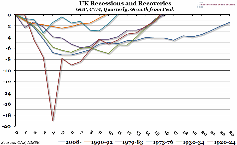
The ONS released their second estimate for Q4 GDP growth today, and it remained at 0.7%. Included in their report, however, was a comparison of this recession and recovery with the three most recent ones. We’ve taken that chart and expanded it to include the two other big recessions from the past century.
What does the chart show?
Somewhat similar to a chart we produced last year, this chart shows the quarterly change in Gross Domestic Product (GDP) over the six biggest recessions and recoveries in the last 100 years, compared to the pre-recession peak. Note that the ONS records only go back to the 1940s, so for the 1920s and 1930s we have used estimates of the GDP originally produced by the NIESR.
Why is the chart interesting?
We are now six years on from the 2008 recession, and as the ONS report points out, we have experienced the deepest recession and longest recovery in the post-war period. When you include the two inter-war recessions, the 2008 recession is no longer the deepest (in fact, the recession in 1920 was well over twice as deep at the worst point), but it remains the slowest recovery by far. The growth in 2013 of 1.8% (revised down this month from 1.9%) was a welcome relief from the economic gloom the country has faced for more than half a decade, but it has still left us 1.4% below the pre-recession peak. It looks like 2014 might be the year that the economy finally breaks through to new ground.

