Summary
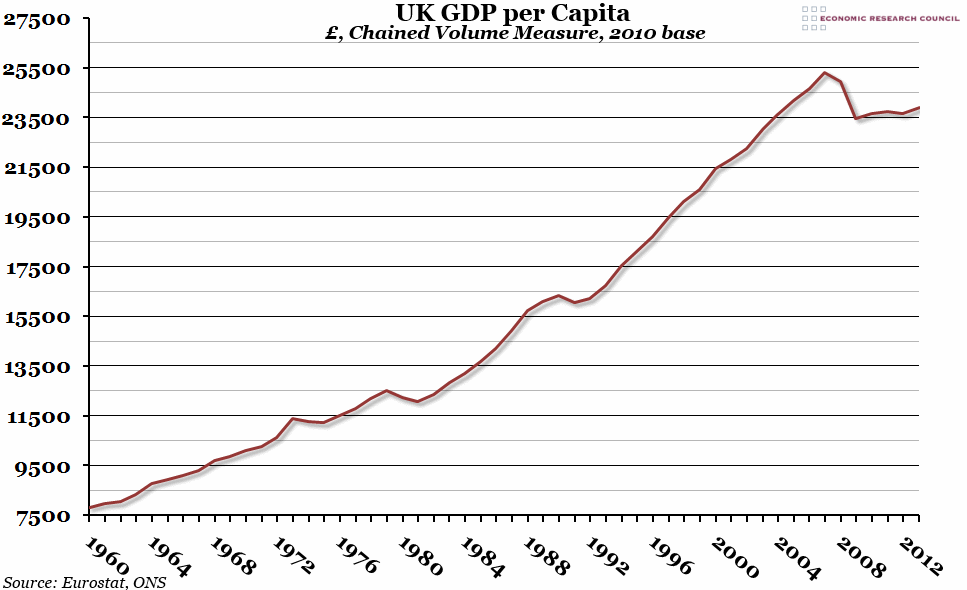
Encouraging GDP figures were released this week, showing that growth in the final quarter of 2013 was 0.7% on the previous quarter, and annual growth for 2013 was 1.9%. This week’s chart shows how GDP per capita has grown since 1960, and just how severe the 2008 crash was.
What does the chart show?
This chart shows gross domestic product (GDP), adjusted for inflation using the chained volume measure (with 2010 as the base year) and divided by the average estimated population in each year to get a per capita figure.
Why is the chart interesting?
GDP per capita increased by £17,500 between 1960 and 2007 (from £7,824 per person to £25,324 per person), and there were only a few years over this period when it failed to grow. With that context in mind, the decrease between 2007 and 2009 of almost £2,000 per person looks catastrophic, and the recovery since has been disappointing to say the least. However, the year on year growth in 2013 was faster than in any of the years since 2007, and many forecasts expect the rate of growth to pick up again in 2014. Nevertheless, it is worth bearing in mind that 2003 to 2013 was the worst decade of GDP per capita growth on record (breaking the record previously held by 2002 to 2012).

