Summary
The Office for National Statistics has pointed out in this month’s Economic Review that the increasing propensity for employees to move jobs is, perhaps even more than falling unemployment, a key indicator of the labour market recovery.
What does the chart show?
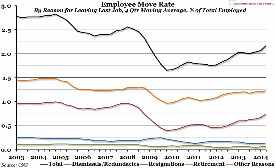
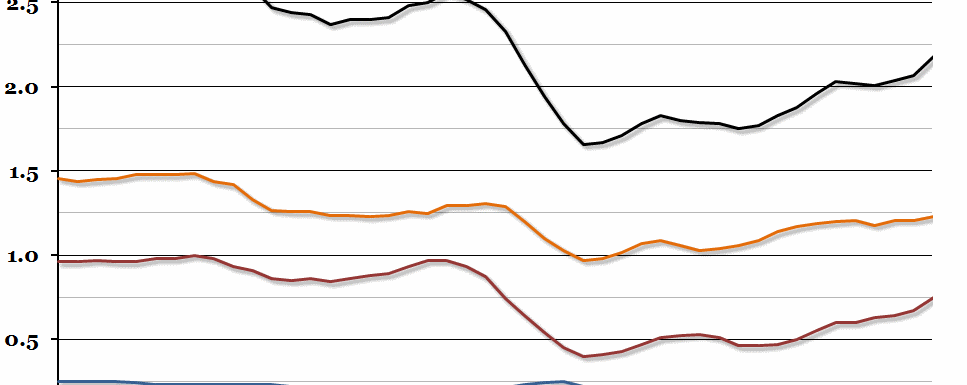
The black line is the total move rate, averaged over the previous four quarters. This is the percentage of all employees who move between one employer and another during each period. Each coloured line shows the breakdown of the reason for the move: the blue line shows moves due to dismissals and redundancies, the red line due to resignations, the green line due to retirement, and the orange line due to “other reasons” (including a temporary job ending, poor health, family reasons, or to pursue further education).
Why is the chart interesting?
As the ONS points out, as employees feel more positive about the labour market, they are more likely to feel confident enough to switch jobs. You can clearly see the effect of the 2008 financial crisis, as dismissals/redundancies peaked and people choosing to leave jobs decreased. Since then, the move rate has slowly increased, but after stalling slightly in 2013 the recovery has really picked up in the last six months. In the second quarter of 2014 we reached the point where the move rate was the highest it had been since the end of 2008, and that recovery is more to do with resignations than any other cause. This is exactly what one would hope to see, as it indicates people are beginning to move jobs voluntarily due to a strong labour market.

