Summary
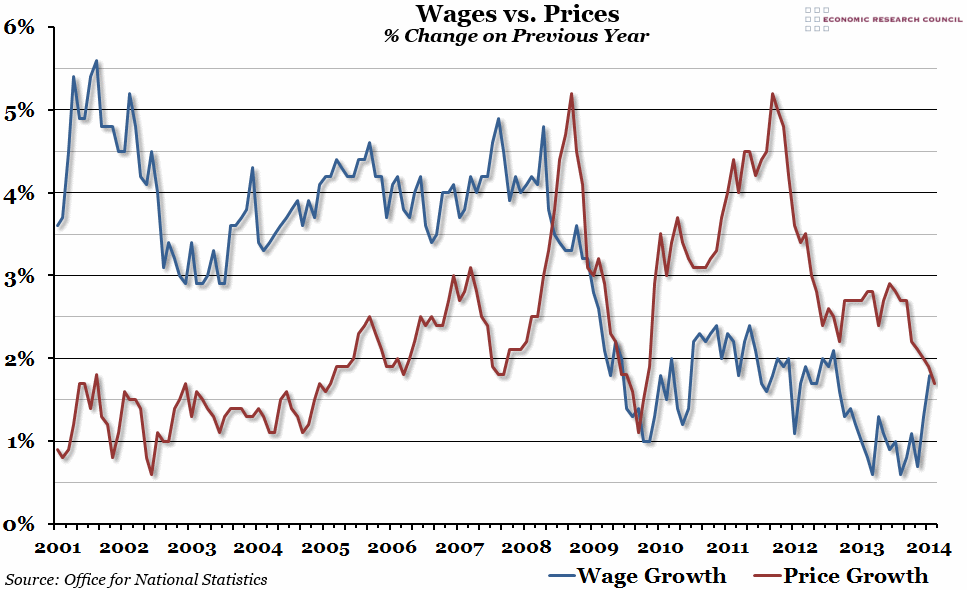
Inflation figures for February were released this week, showing a further fall in the CPI measure to 1.7%. Although we don’t yet have earnings growth figures for February, it looks like we might see the first real terms wage growth since September 2009 very soon.
What does the chart show?
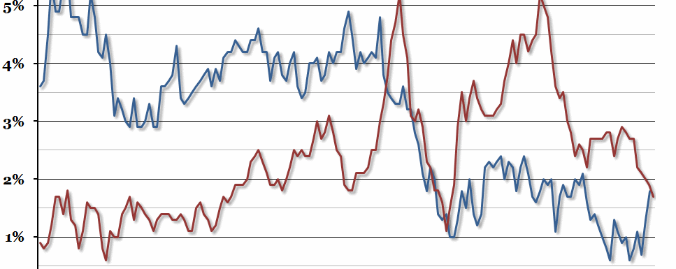
The blue line represents the percentage change in average weekly earnings (excluding bonuses) compared to the same month the previous year. The red line shows the percentage change in the CPI measure of inflation, also compared to the same month the previous year.
Why is the chart interesting?
This time last year, we produced a similar chart, accompanied by the story that the gap between wages and prices had opened up to a record level. One year on, and it looks like earnings might overtake inflation for the first time since 2009. This has been caused by a dramatic drop in inflation over the past few months, accompanied by a promising rise in earnings in January 2014. We’ll have to wait until next month to find out if earnings really did overtake inflation in February, but it seems likely that it will happen soon. This won’t overturn the half-decade of real earnings contraction, but it will hopefully mark the beginning of a period of growth that will help to ease the cost of living crisis.

