Summary
Public sector finance figures were released at the end of last week, showing that net borrowing had decreased in the financial year 2012/13. We take a look back at the past forty years of public finances.
What does the chart show?
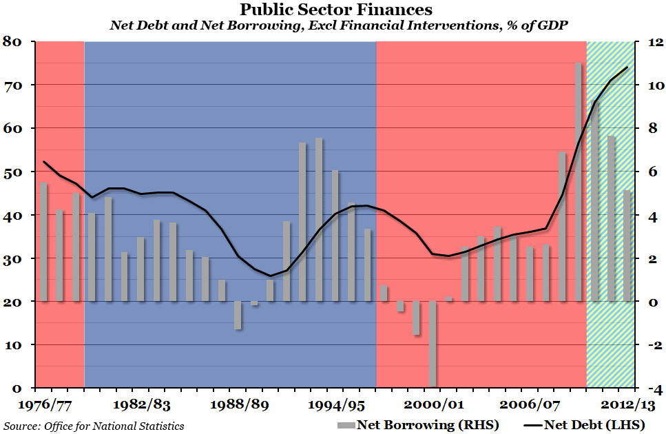
The black line, measured against the left hand side, shows the total public sector net debt, excluding the effect of financial interventions, as a percentage of GDP. The gray bars, measured against the right hand side, show public sector net borrowing, also excluding financial interventions and as a percentage of GDP. A positive figure for net borrowing is the budget deficit; a negative figure for net borrowing means there was a budget surplus that year. The background shading shows which political party was in power at the time – red for Labour, blue for Conservatives, and the rather attractive blue/yellow striped pattern to signify the Conservative – Liberal Democrat coalition.
Why is the chart interesting?
The level of government debt has been at the forefront of economic and political discussions for the last few years, and one of the current government’s key aims is to eliminate the deficit and reduce the debt. As you can see, the deficit has been falling as a percentage of GDP for the past three years, although it remains higher than at any point between 1994 and 2008. Of the thirty-seven years represented in the chart, there have only been five with budget surpluses: 1988 to 1990, and 1998 to 2001. When the total level of debt to GDP has fallen in other years, it has been as a result of GDP growing faster than the debt. By showing the political party in power at the time, you can see that until the 2008 crisis, management of the debt had been fairly even across both parties – the level of debt has both risen and fallen under both the Conservatives and Labour. The most recent dramatic increase in the debt to GDP ratio was as a result of that crisis, when government deficits increased and GDP crashed.

