Summary
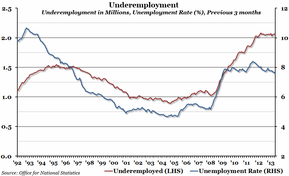
The unemployment rate over the past three months fell to 7.6%: the lowest point since the first half of 2009. However, the total number of people who are underemployed remains at the highest level since records began twenty years ago.
What does the chart show?
The blue line, measured against the right hand axis, shows the unemployment rate, or the percentage of people aged 16 and over who are currently looking for a job but who have been unable to find one. The red line, measured against the left hand axis, is the total number of people (in millions) who are currently in part-time or temporary work because they can’t find full-time or permanent jobs.
Why is the chart interesting?
As you can see from the chart, there was a bump in unemployment in 2011. We have not only recovered from that, but in the three months from July to September this year the unemployment rate has begun to drop below the post-crisis plateau reached in 2009 (which was admittedly much lower than in the early 1990s). This is good news, and should make a real difference to ordinary people if the trend continues. However, opinion polls repeatedly show that the general public don’t feel that the recovery is having a positive effect on their lives, and part of the reason for that is underemployment.
Since the beginning of 2011, there have been over two million people who have been stuck in part-time or temporary jobs because they haven’t been able to find full-time, permanent positions (this number does not include people in part-time work due to choice, illness or disability). Although the unemployment rate has been falling since then, the number of underemployed has been staying stubbornly steady. The sense that the recovery is passing many people by will persist for as long as this remains the case.

