While the goal of boosting home ownership and economic growth is commendable, the key question remains: is loosening restrictions on high loan-to-income mortgages truly the right solution?
Chart of the Week
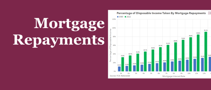
Summary When faced with the prospect of rising interest rates, some have dismissed the potential pain it will cause by arguing that rates were much higher in the 80s and 90s. This week’s chart compares the impact on living standards that high mortgage rates had on homeowners in the late 80s to the present day, […]
Chart of the Week: Week 28, 2015: UK Housing Affordability
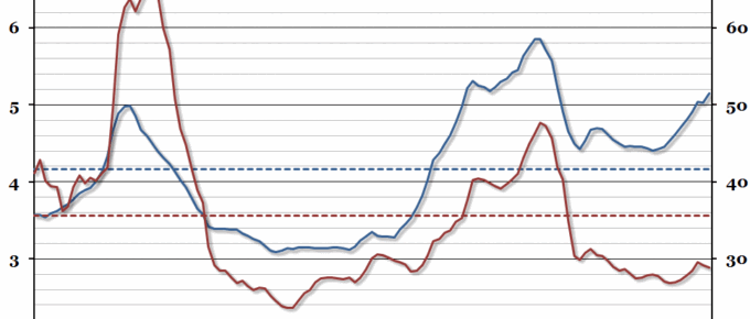
In this year’s edition of our annual chart on housing affordability in the UK (you can see last year’s chart here), the average house price has continued to grow to more than five times earnings, while mortgage affordability has started to improve.
Chart of the Week: Week 30, 2014: UK Housing Affordability
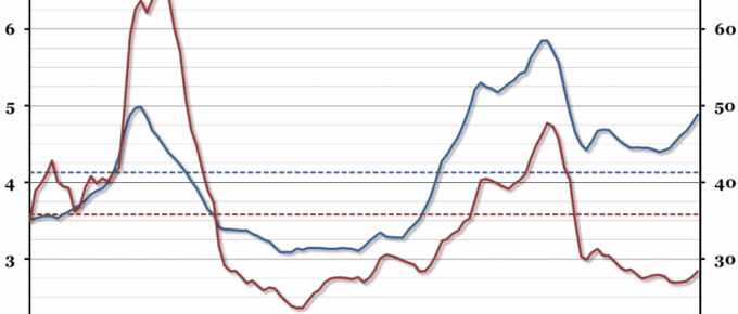
This year, our annual chart on housing affordability shows quite a dramatic increase in the house price to earnings ratio, and unlike last year, mortgage affordability has also declined.


