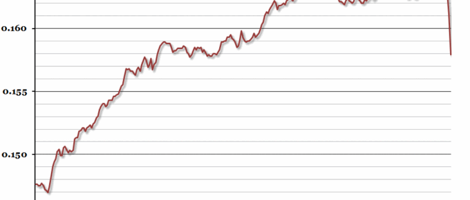
Over the last couple of weeks, there has been a lot of coverage of the devaluation of the Chinese currency.
Latest Blogposts
Chart of the Week: Week 32, 2015: UK Real Earnings Growth
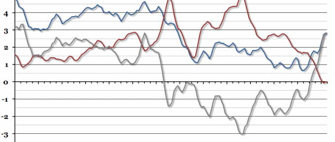
The labour market statistics released this morning showed regular average earnings (excluding bonuses) growing by 2.8% in the second quarter of the year (compared to Q2 2014).
Chart of the Week: Week 31, 2015: US and UK Recoveries
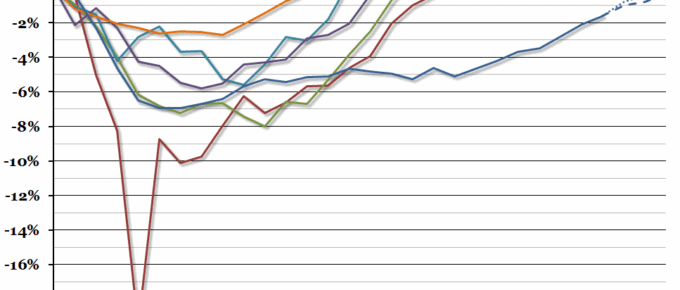
Last week, we compared the latest UK recession and recovery to historical recessions. This week, we’re comparing the UK recovery to that of the US, where despite first quarter growth problems, the recovery from the recession looks strong.
August 2015
The decline in growth in China is contributing to depressing the prices of commodities and the knock-on effect for Africa, Latin America and even Australia is depressing their economies. The economic pain in Latin America …
Chart of the Week: Week 30, 2015: UK Recessions and Recoveries
The preliminary GDP growth figures for the second quarter of the year, released yesterday, showed a recovery from the disappointing growth of the first quarter.
Chart of the Week: Week 28, 2015: UK Housing Affordability
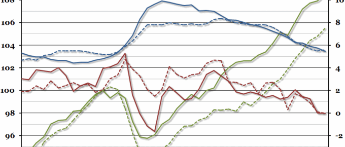
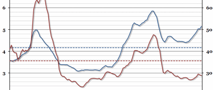
In this year’s edition of our annual chart on housing affordability in the UK (you can see last year’s chart here), the average house price has continued to grow to more than five times earnings, while mortgage affordability has started to improve.

