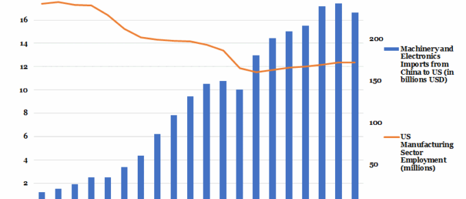
Imports from China into the USA have increased more than sixfold in the last twenty years, with the US trade deficit with China currently at $336 billion. ‘Made in China 2025’, the Chinese government drive to dominate the global market in 10 sectors…
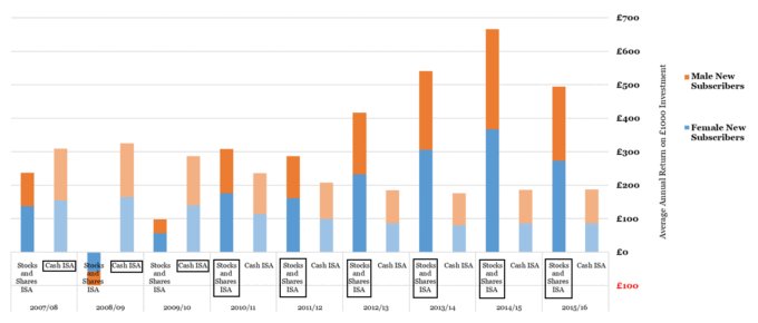
Chart of the Week: Week 27, 2018: Gender Split and Returns of Cash vs Stocks and Shares ISAs
In general, women hold more ISAs than men (an average of 52% across ISA products), however in every year displayed, men are more likely to opt for stocks and shares ISAs when they do invest in ISAs. The number of men subscribing to new ISAs has fallen in recent years, reflecting an increased appetite for other, higher-risk investments…
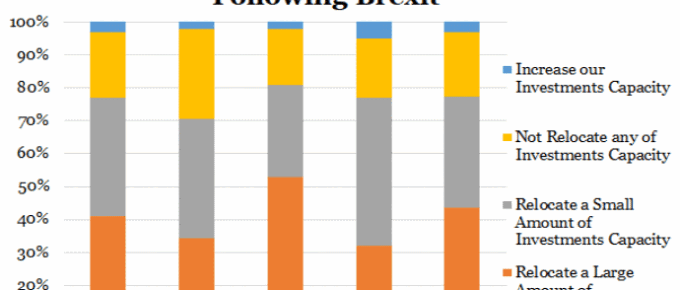
Chart of the Week: Eurozone Companies’ Plans to Withdraw UK Investment
The chart shows a very pessimistic view of investment in the UK as a result of Brexit. On average, over three-quarters of companies headquartered in the displayed nations have stated their intention to move at least some of their investments out of the UK as a result of Brexit.
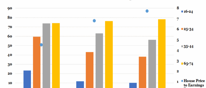
Chart of the Week: 20th June 2018: Home Ownership vs House Price to Earnings Ratio
Last year saw the emergence of five London boroughs where houses ‘earned’ more in a year than their owners; most starkly in Barnet, where on average home-owners earned £54.6k net whereas their homes grew in value by nearly £107k.
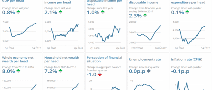
Chart of the Week: June 2018: Explore Changes to the UK Economy
The charts show key changes in the UK economy… click to find out more!
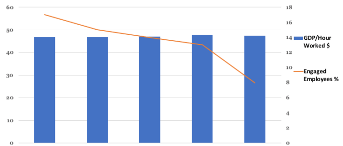
Chart of the Week: Week 4, 2018: GDP per Hour Worked v.s. Employee Engagement
The chart shows that just 8% of UK employees are enthused about their work and work environment in 2016. This represents a fall from 17% in 2012. The chart …

