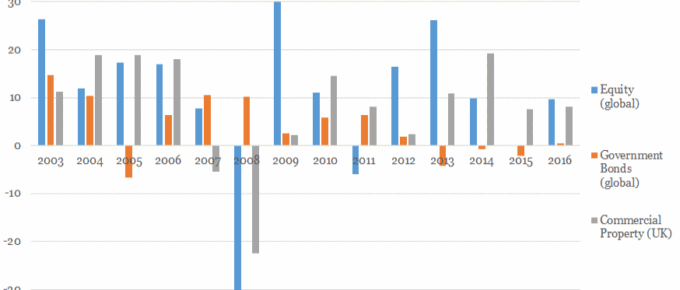
This chart shows a snapshot of the performance of different asset classes: UK commercial property, global government bonds and global equity since 2003.
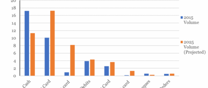
Chart of the Week: Week 23, 2017: Changes to Consumer Payment Methods
The chart shows that cash remains the most popular method of payment in 2015, although following a sustained downward trend, 2015 represents the first year in which under half (45%) of all consumer payments were made using cash.

Chart of the Week: Week 22, 2017: Household Income Distribution
The chart shows that average disposable household income for the top quintile of UK households stands at over £67,000 and that of the poorest quintile is just over £13,000, more than 5 times lower.
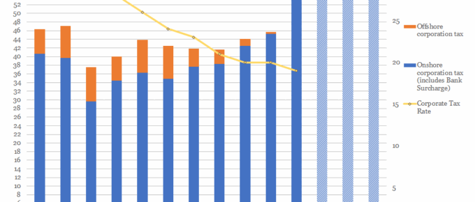
Chart of the Week: Week 21, 2017: Corporation Tax Rates v.s. Receipts
The chart shows that, despite consistent reductions in the taxation rate, yearly receipts of corporation tax have remained relatively stable over the last decade.

May 2017
In the UK, the Prime Minister sprung a completely unexpected election. On analysis,
it was called for understandable reasons, however, it was a brave move. The Prime
Minister’s negotiating position…
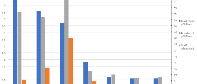
Chart of the Week: Week 18, 2017: Global FinTech Hubs by Market and Staff Size
The FinTech industry in London and in New York clearly benefit from their proximity to global banking centres although London commands the lion’s share of the market, estimated to be £6.6 billion.